進階人口地圖

在 R 中分析美國人口普查資料

Kyle Walker

Instructor

地圖學中的視覺變數
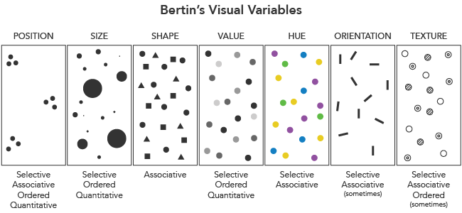
Axis Maps 的視覺變數

在 R 中分析美國人口普查資料

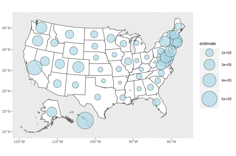
分級符號地圖

library(sf)

centers <- st_centroid(state_value)

ggplot() + geom_sf(data = state_value, fill = "white") + geom_sf(data = centers, aes(size = estimate), shape = 21, fill = "lightblue", alpha = 0.7, show.legend = "point") + scale_size_continuous(range = c(1, 20))
在 R 中分析美國人口普查資料

分級符號

在 R 中分析美國人口普查資料

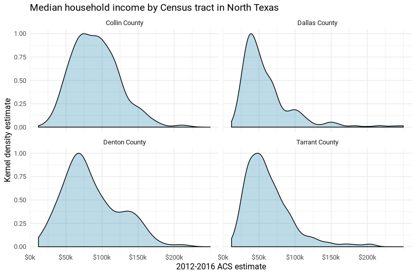
分面圖

在 R 中分析美國人口普查資料

使用 ggplot2 製作分面地圖

ggplot(dc_race, aes(fill = percent, color = percent)) + 
  geom_sf() + 
  coord_sf(datum = NA) + 
  facet_wrap(~variable)
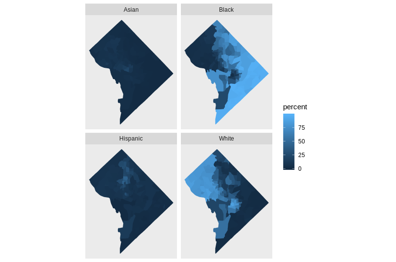
分面地圖

在 R 中分析美國人口普查資料

互動式視覺化

  • 網頁式圖形可與資料進行互動

  • R 中的選項:

    • leaflet
    • plotly
    • htmlwidgets
在 R 中分析美國人口普查資料

使用 mapview 製作互動地圖

library(mapview)
mapview(cook_value, zcol = "estimate", legend = TRUE)
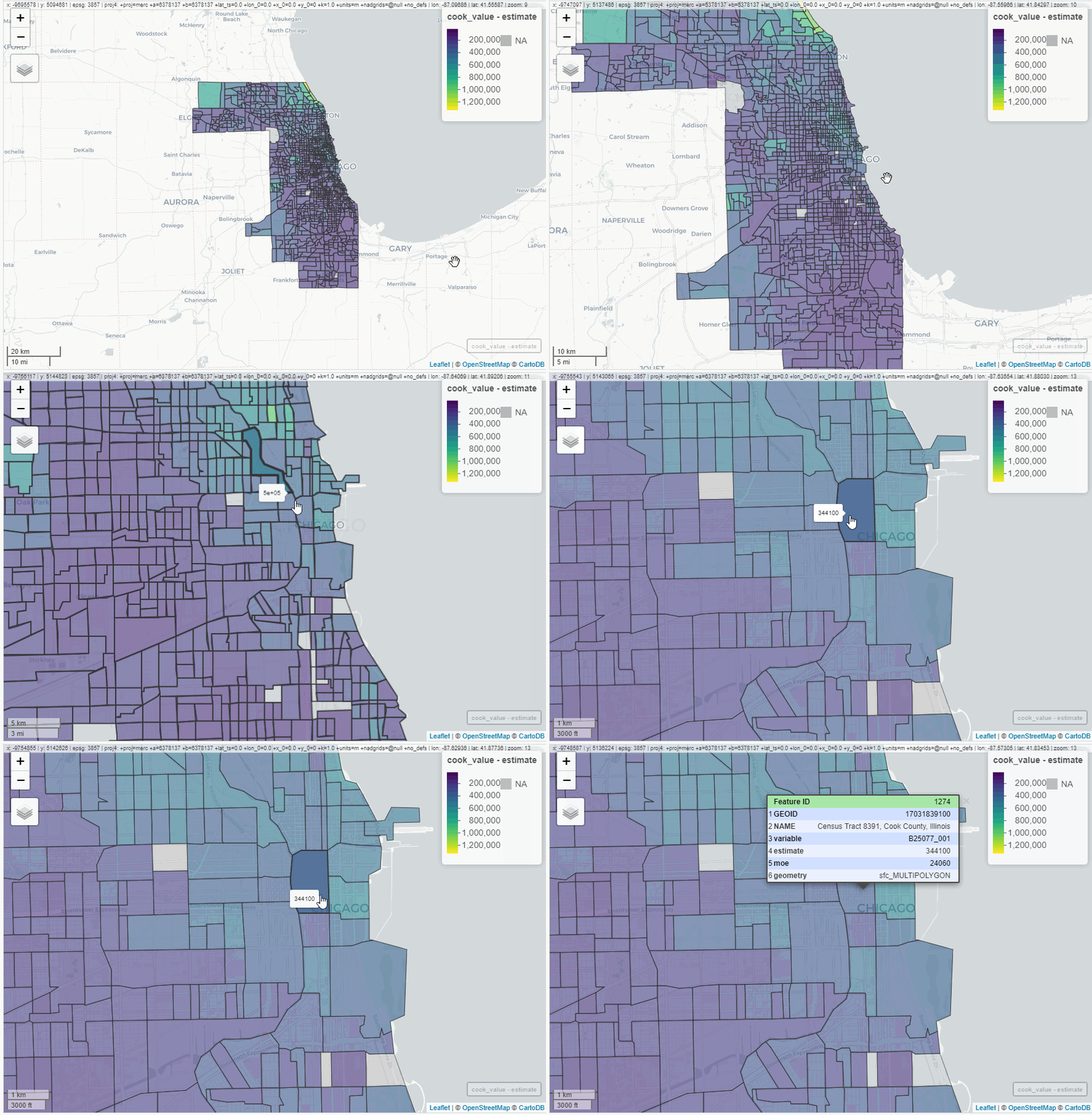
mapview 動態示意圖

在 R 中分析美國人口普查資料

一起來練習吧!

在 R 中分析美國人口普查資料

Preparing Video For Download...