在 ACS 中視覺化誤差範圍

在 R 中分析美國人口普查資料

Kyle Walker

Instructor

視覺化不確定性

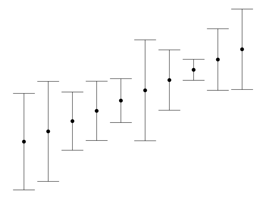
  • 常見做法:誤差棒圖

誤差棒圖範例

在 R 中分析美國人口普查資料

在 ggplot2 中繪製誤差範圍圖

  • 在 ggplot2 中:geom_errorbar()geom_errorbarh()
library(tidycensus)
library(tidyverse)

wyoming_age <- get_acs(geography = "county", 
                       variables = c(medianage = "B01002_001"), 
                       state = "WY")  

ggplot(wyoming_age, aes(x = estimate, y = NAME)) + 
  geom_errorbarh(aes(xmin = estimate - moe, 
                     xmax = estimate + moe)) + 
  geom_point()
在 R 中分析美國人口普查資料

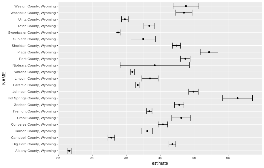
未排版的誤差範圍圖

在 R 中分析美國人口普查資料

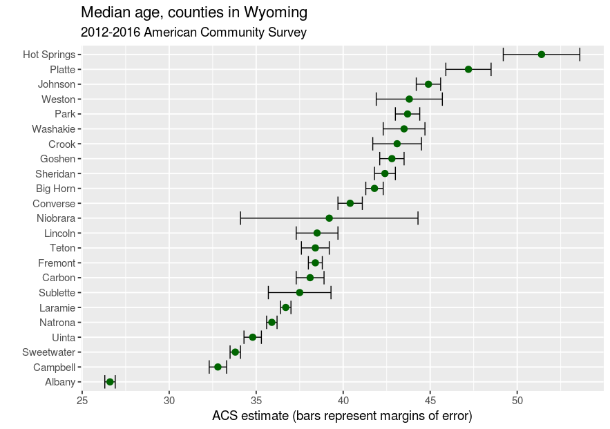
誤差範圍圖的排版

wyoming_age2 <- wyoming_age %>%
  mutate(NAME = str_replace(NAME, " County, Wyoming", ""))

ggplot(wyoming_age2, aes(x = estimate, y = reorder(NAME, estimate))) + geom_errorbarh(aes(xmin = estimate - moe, xmax = estimate + moe)) + geom_point(size = 3, color = "darkgreen") + theme_grey(base_size = 14) + labs(title = "Median age, counties in Wyoming", subtitle = "2012-2016 American Community Survey", x = "ACS estimate (bars represent margins of error)", y = "")
在 R 中分析美國人口普查資料

已排版的誤差範圍圖

在 R 中分析美國人口普查資料

一起來練習吧!

在 R 中分析美國人口普查資料

Preparing Video For Download...