自訂座標軸

使用 Bokeh 製作互動式資料視覺化

George Boorman

Core Curriculum Manager, DataCamp

折線圖

source = ColumnDataSource(data=apple)
fig = figure(x_axis_label="Date", y_axis_label="Market Cap ($)")
fig.line(x="date", y="market_cap", source=source)

output_file(filename="unformatted_plot.html") show(fig)
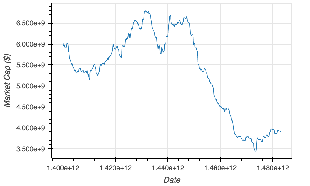
未格式化的蘋果圖

使用 Bokeh 製作互動式資料視覺化

X 軸型別

source = ColumnDataSource(data=apple)
fig = figure(x_axis_label="Date", y_axis_label="Market Cap ($)",

x_axis_type="datetime")
fig.line(x="date", y="market_cap", source=source) output_file(filename="unformatted_plot.html") show(fig)
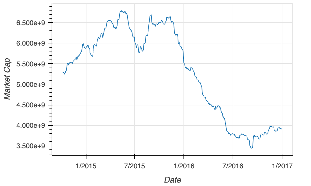
設定 x 軸型別的折線圖

使用 Bokeh 製作互動式資料視覺化

格式化選項

  • NumeralTickFormatter
  • 參數:format
format 輸出
1500.00 "$0.00" $1500.00
2000.00 "$0" $2000
5000.00 "$0,0" $5,000
1100000 "$0.0a" $1.1m
5000000000 "$0a $5b
  • DatetimeTickFormatter
  • 參數:months
months 輸出
"2018-03-01" "%B %Y" "March 2018"
"2019-10-15" "%b %Y" "Oct 2019"
"2020-02-09" "%b %y" "Feb 20"
  • 其他參數:
    • microsecondsmillisecondssecondsminisecminuteshourminhoursdaysyears
使用 Bokeh 製作互動式資料視覺化

NumeralTickFormatter

from bokeh.models import NumeralTickFormatter

fig = figure(x_axis_label="Date", y_axis_label="Price ($)") fig.line(x="date", y="market_cap", source=source)
fig.yaxis[0].formatter = NumeralTickFormatter(format="$0.0a")
output_file(filename="formatted_y_axis.html") show(fig)
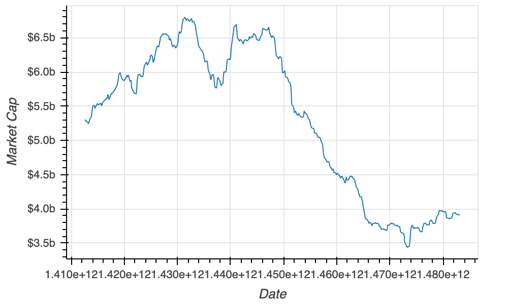
蘋果圖(格式化 Y 軸)

使用 Bokeh 製作互動式資料視覺化

DatetimeTickFormatter

from bokeh.models import NumeralTickFormatter, DatetimeTickFormatter

fig = figure(x_axis_label="Date", y_axis_label="Price ($)") fig.line(x="date", y="price", source=source) fig.yaxis[0].formatter = NumeralTickFormatter(format="$0.0a")
fig.xaxis[0].formatter = DatetimeTickFormatter(months="%b %Y")
output_file(filename="formatted_market_cap.html") show(fig)
使用 Bokeh 製作互動式資料視覺化

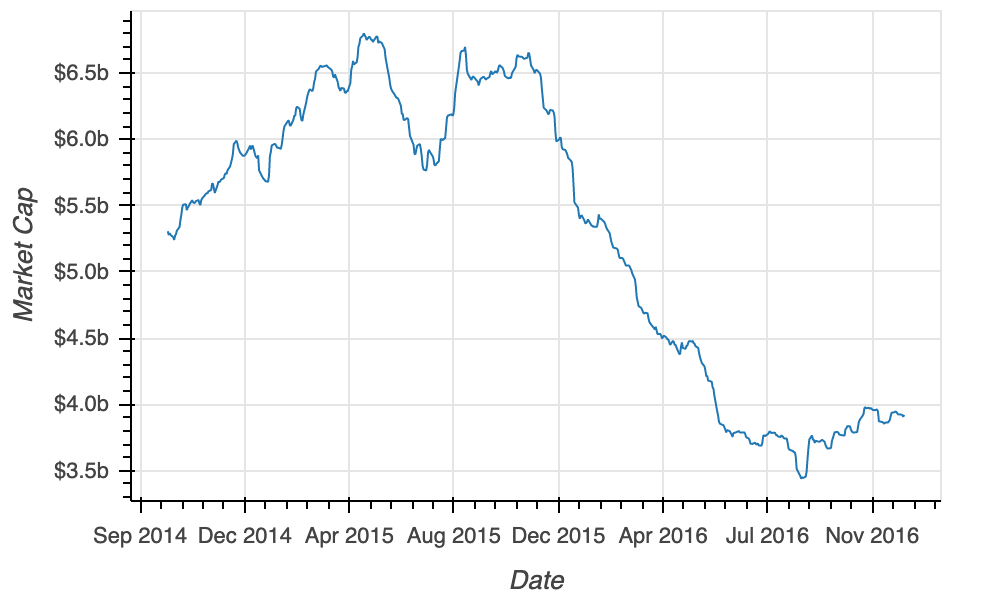
最終圖

最終圖表

使用 Bokeh 製作互動式資料視覺化

一起來練習吧!

使用 Bokeh 製作互動式資料視覺化

Preparing Video For Download...