# Group by each product
grouped = groupby(product, :Product)

# Calculate average prices
mean_prices = combine(
    grouped,
    :Price => mean
)

# Sort from higest to lowest
sorted_mean_prices = sort(
    mean_prices,
    :Price_mean,
    rev=true
)
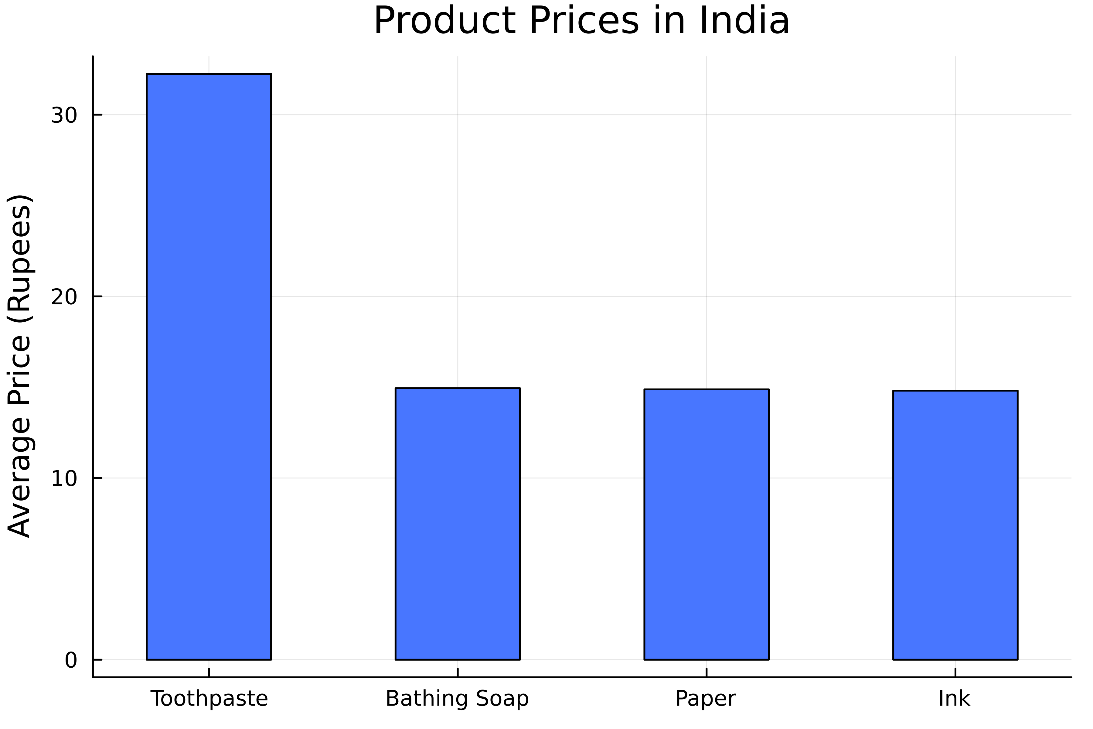
建立長條圖
# Create bar chart
bar(
    # Categories in x-axis
    sorted_mean_prices.Product,
    # Values in y-axis
    sorted_mean_prices.Price_mean,

    # Set bar width
    bar_width=0.5

    label=false,
    color=:royalblue1,
 )
title!("Product Prices in India")
ylabel!("Average Price (Rupees)")
水平長條圖
# Create bar chart
bar(
    # Values in the y-axis
    sorted_mean_prices.Product,
    # Values in x-axis
    sorted_mean_prices.Price_mean,

    # Set orientation to horizontal
    permute=(:x, :y),

    label=false,
    color=:royalblue1,
)
title!("Product Prices in India")
xlabel!("Average Price (Rupees)")
# Group by state and product
filtered_grouped = groupby(filtered_product, [:State, :Product])

# Calculate average prices
filtered_mean_prices = combine(
    filtered_grouped, :Price => mean
)
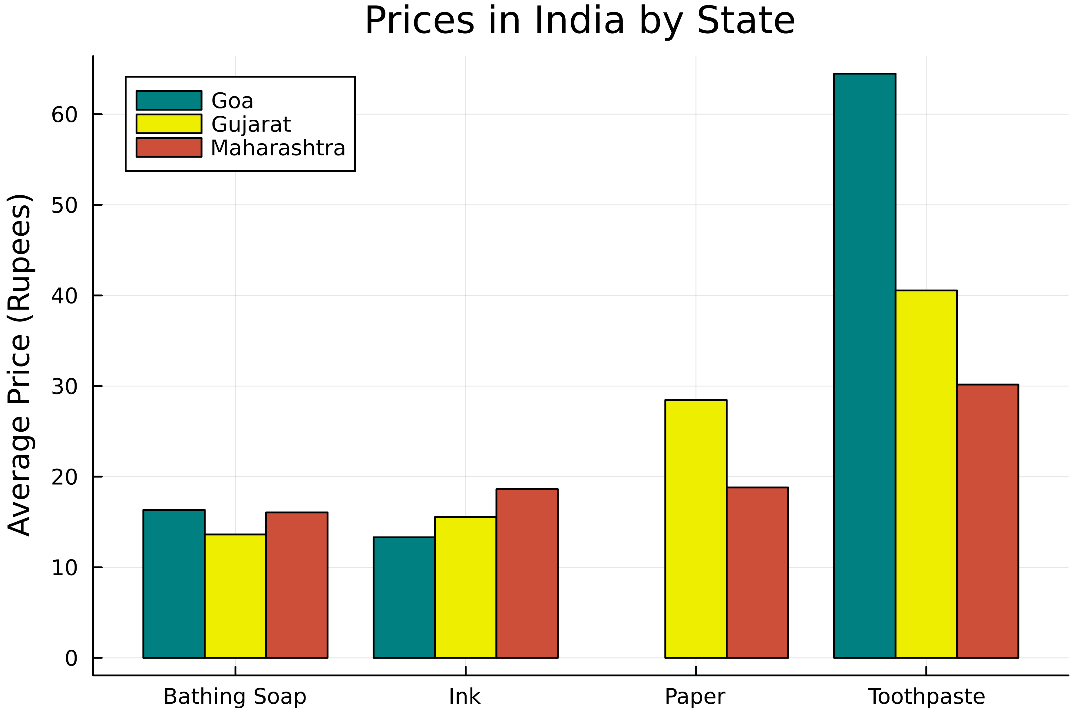
群組長條圖
# Create grouped bar chart
groupedbar(
    # Categories in x-axis
    filtered_mean_prices.Commodity,
    # Values in y-axis
    filtered_mean_prices.Price_mean,

    # Define groups
    group=filtered_mean_prices.State,

    color=[:teal :yellow2 :tomato3]
)
title!("Prices in India by State")
ylabel!("Average Price (Rupees)")
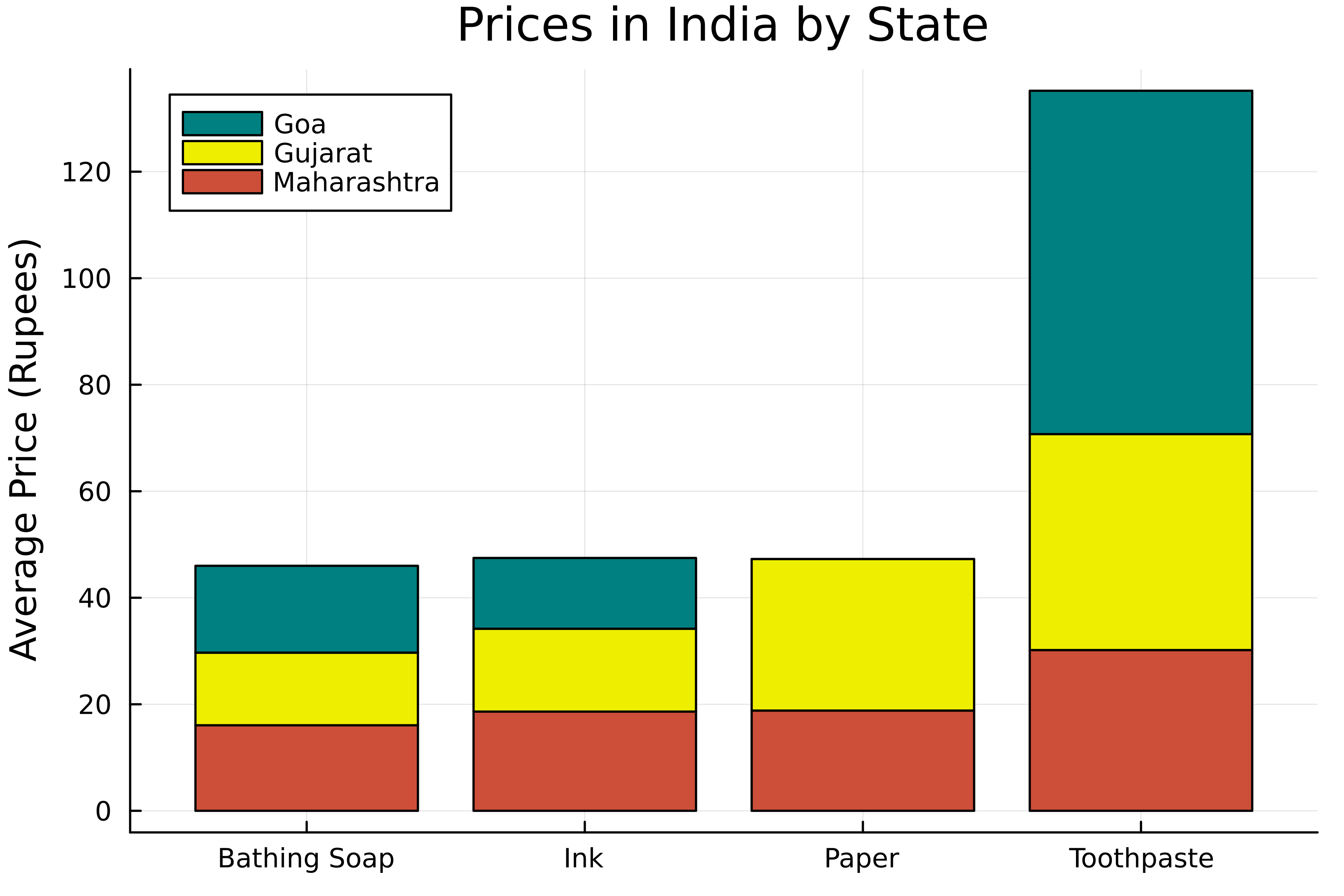
堆疊長條
# Create grouped bar chart
groupedbar(
    # Categories in x-axis
    filtered_mean_prices.Commodity,
    # Values in y-axis
    filtered_mean_prices.Price_mean,
    # Define groups
    group=filtered_mean_prices.State,
    color=[:teal :snow2 :tomato3],

    # Stack the bars
    bar_position=:stack

)
title!("Product Prices in India by State")
ylabel!("Average Price (Rupees)")