Julia 資料視覺化入門
Gustavo Vieira Suñe
Data Analyst
using Plots
# Set theme
theme(thm::Symbol; kwargs...)
thm)可選::default、:dark、:ggplot2、:juno⋯⋯kwargs:設定預設屬性例如,theme(:juno, linecolor=:red, linewidth=5)
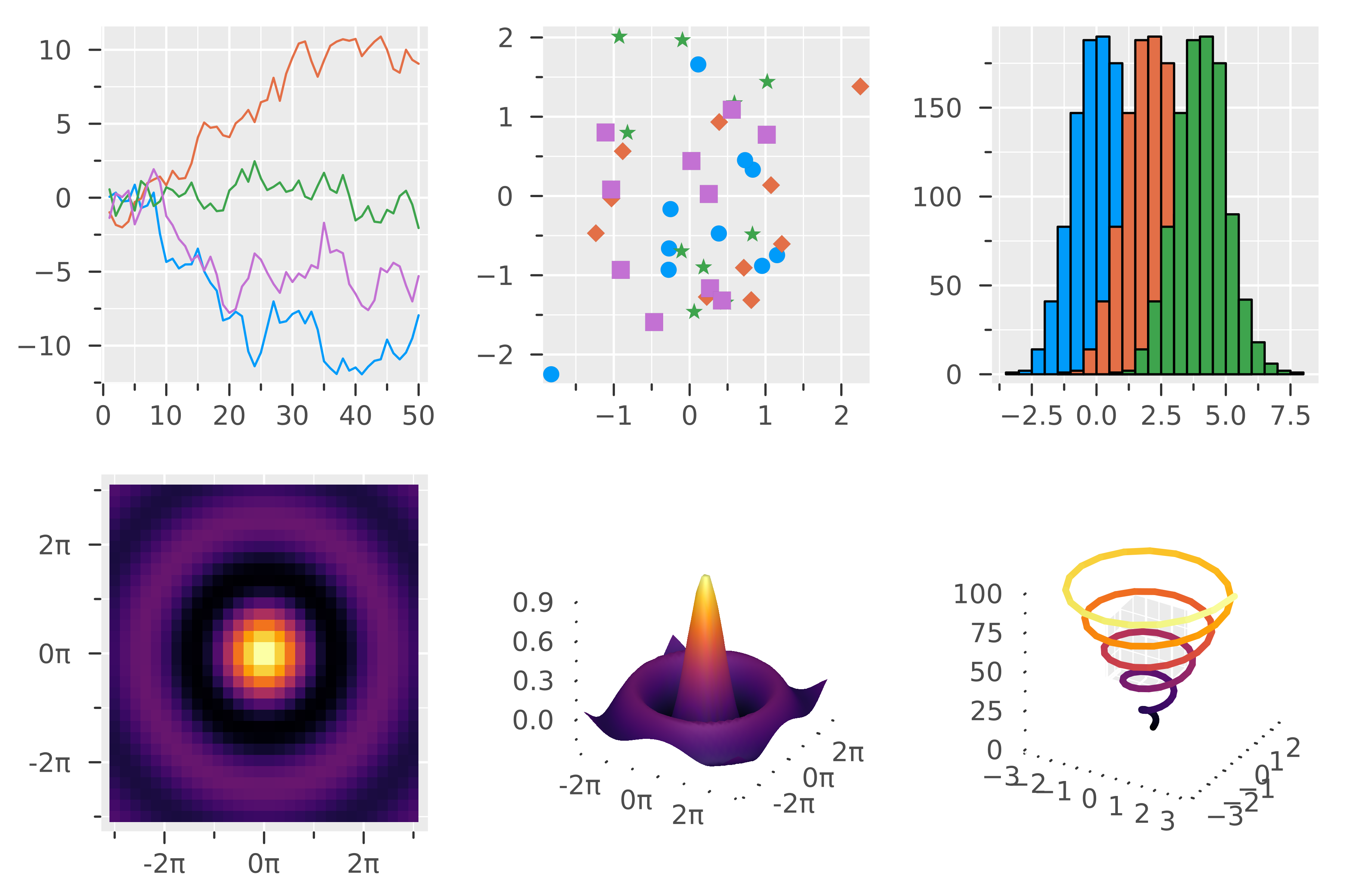
showtheme(:ggplot2)

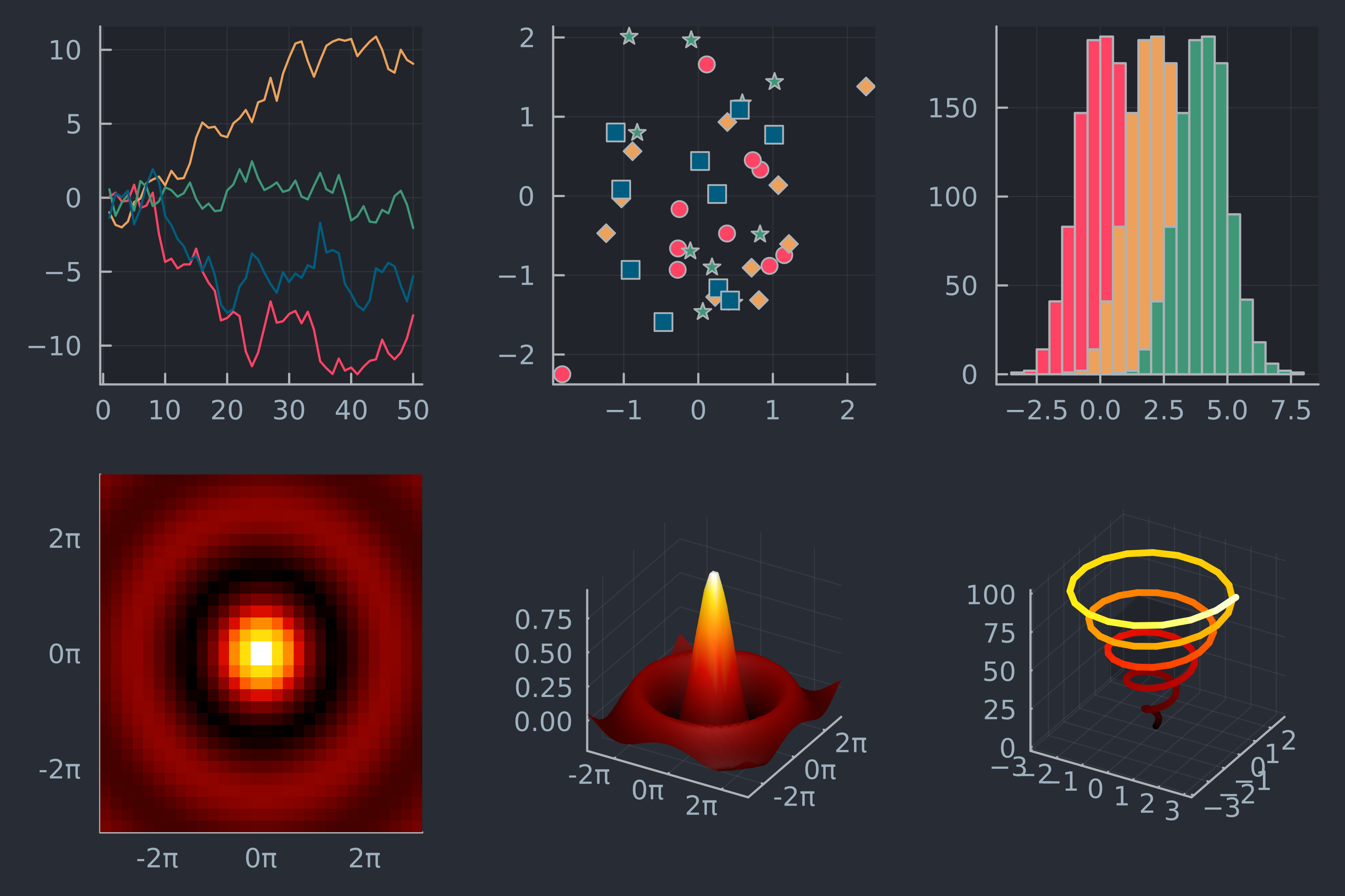
showtheme(:juno)

using DataFrames, CSV, Plots # Load dataset streaming = DataFrame(CSV.File("streaming.csv"))# Group by genre grouped = groupby(streaming, "Fav genre") # Count genres counts = combine(grouped, nrow => :count)
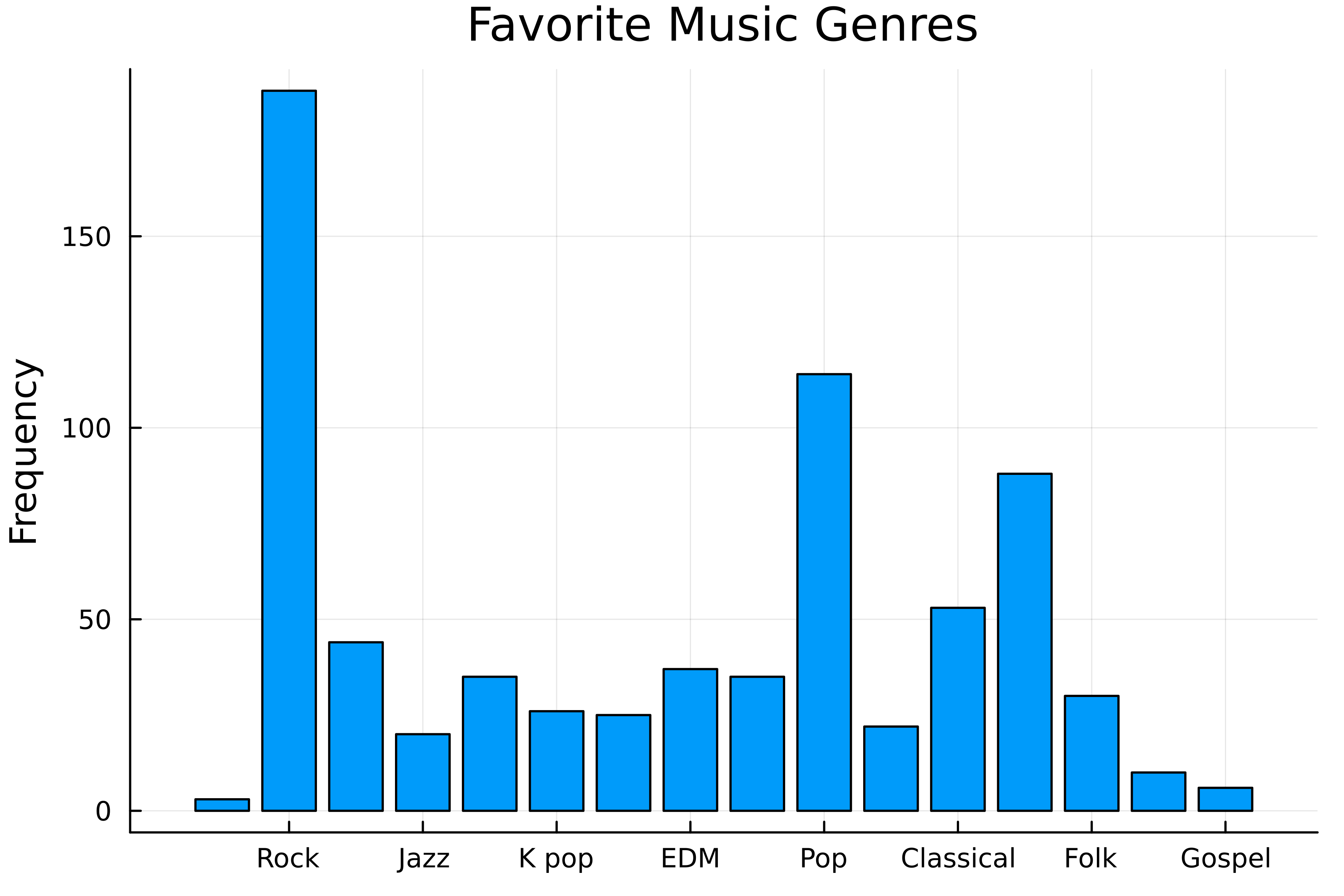
# Bar chart with :default bar( counts[!, "Fav genre"], counts.count,title="Favorite Music Genres" ylabel="Frequency", label=false, )

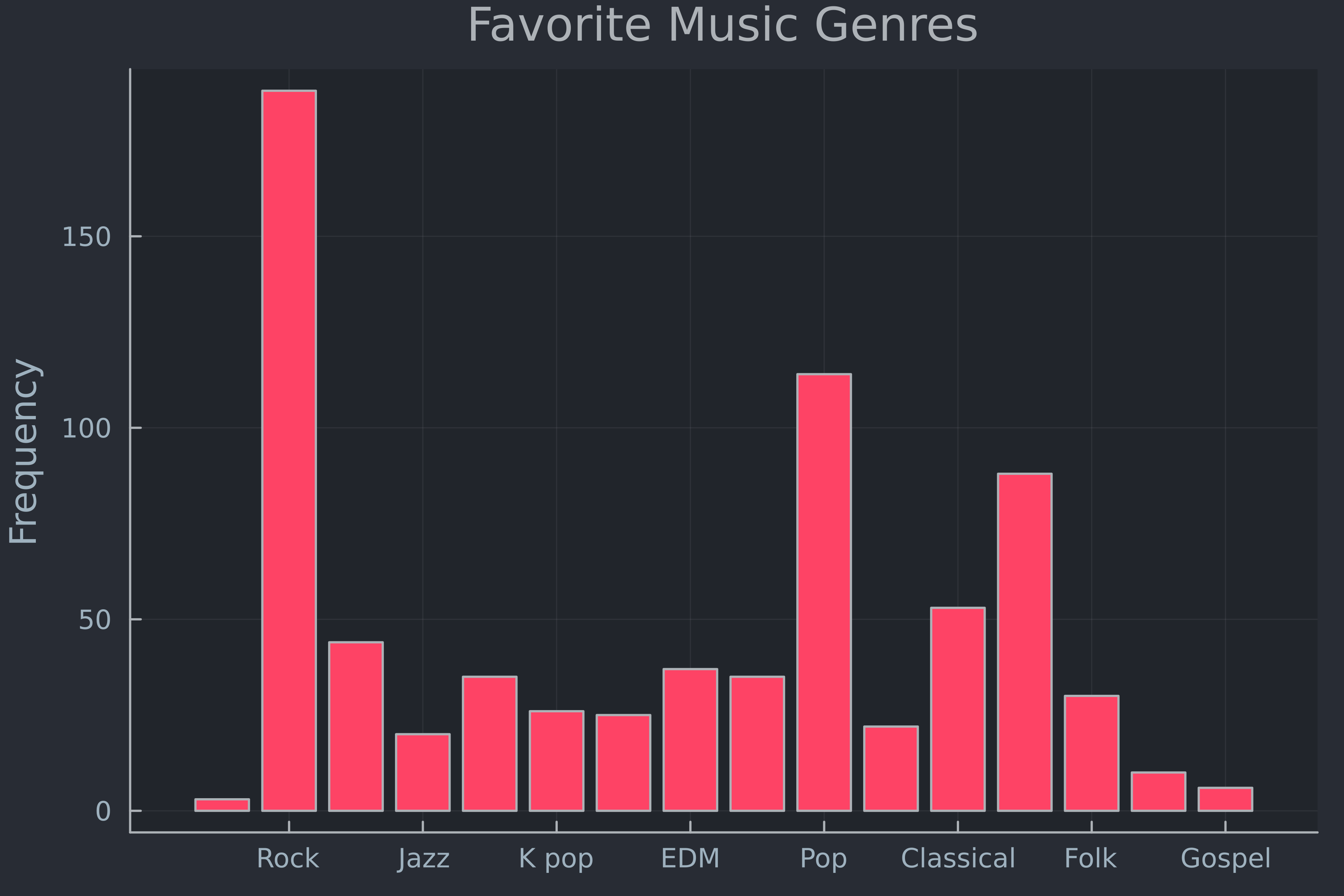
# Set the theme theme(:juno)# Bar chart with :juno bar( counts[!, "Fav genre"], counts.count, label=false, ylabel="Frequency", title="Favorite Music Genres" )

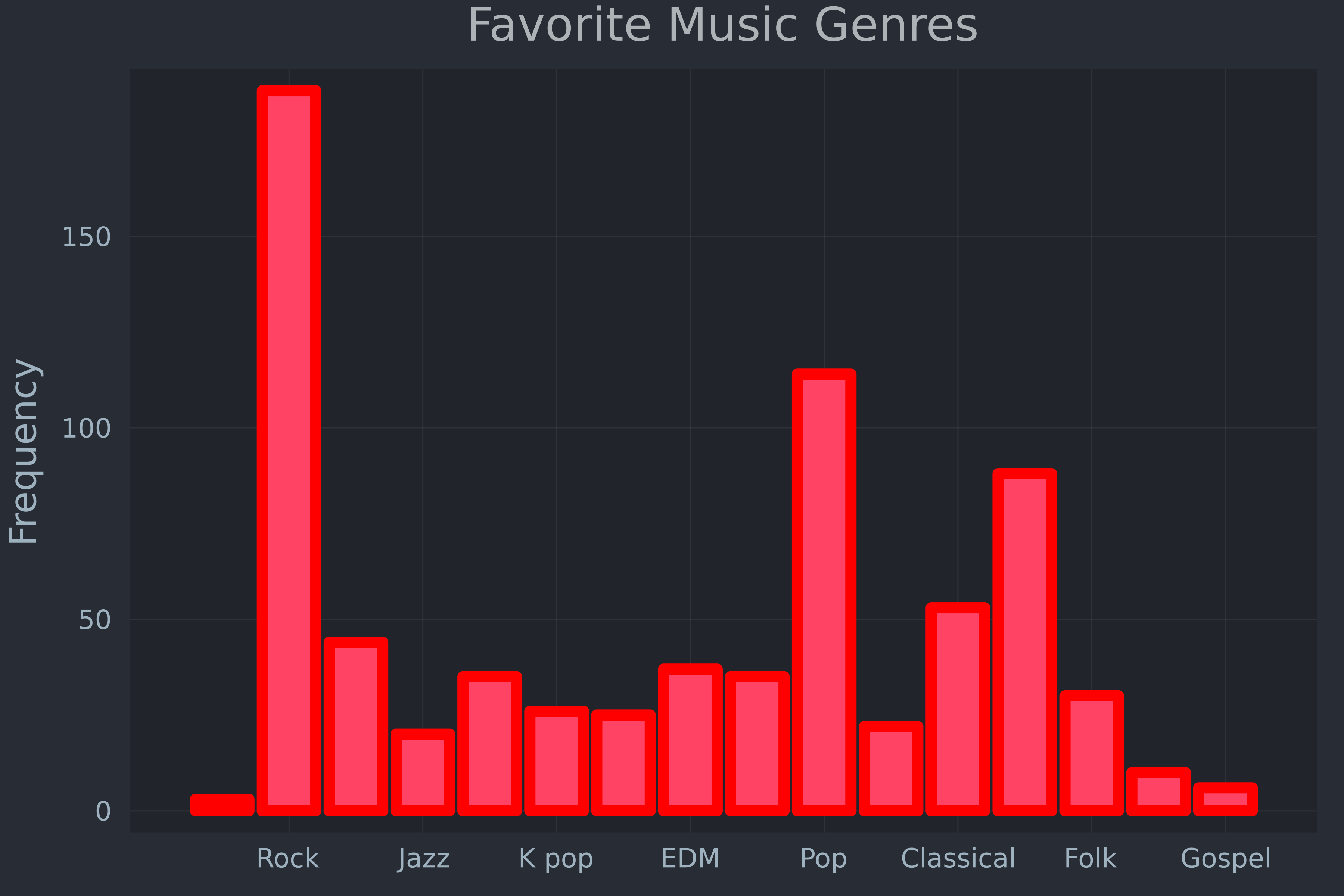
theme( :juno,# Default line color and width linecolor=:red, linewidth=5,# Hide the axis lines framestyle=:grid )bar( counts[!, "Fav genre"], counts.count, label=false, ylabel="Frequency", title="Favorite Music Genres" )

savefig("genres.png")Julia 資料視覺化入門