從 DataFrame 繪製多圖

Julia 資料視覺化入門

Gustavo Vieira Suñe

Data Analyst

在單一圖中呈現多個變數
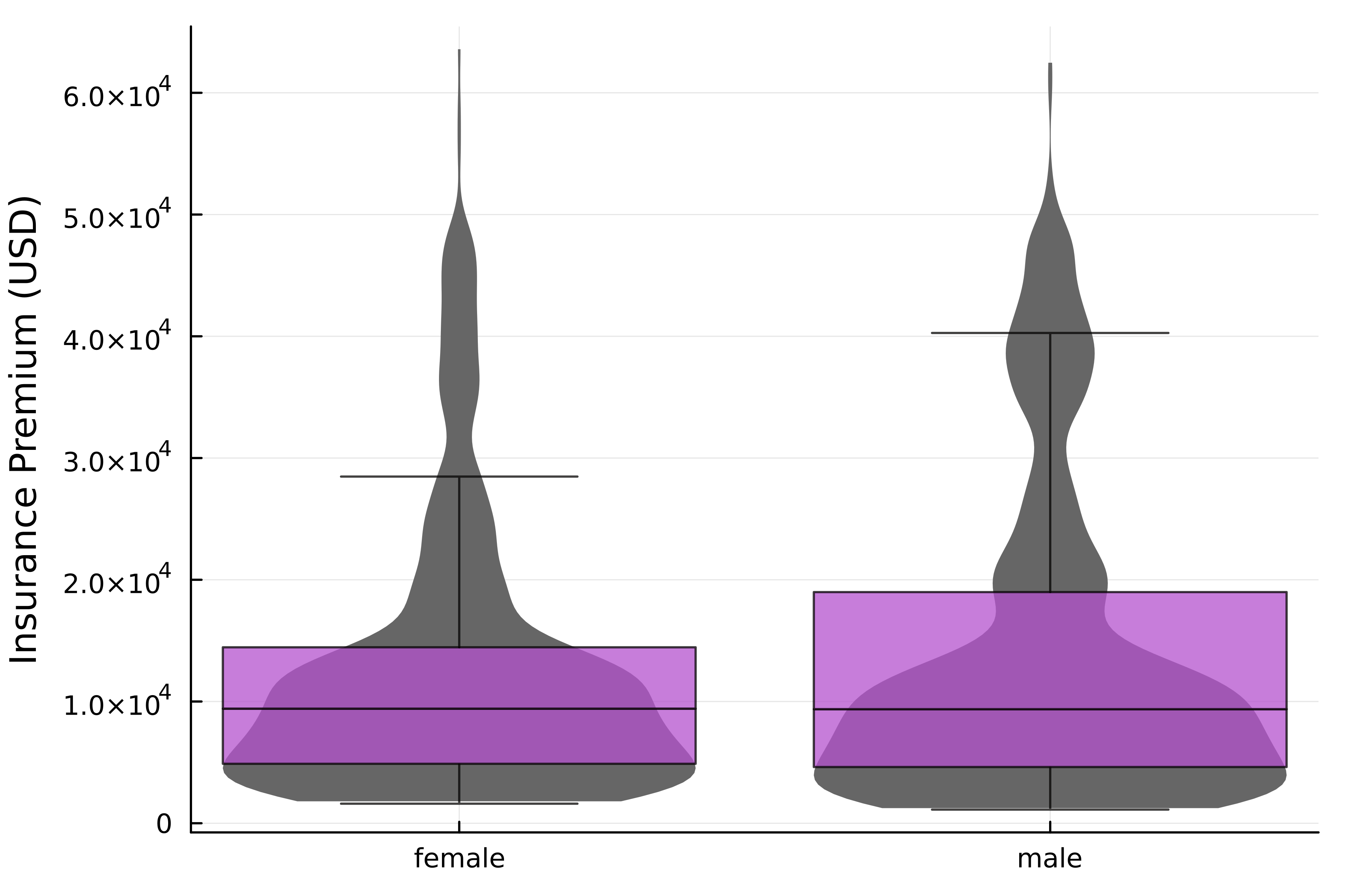
# Violin plot
@df insurance violin(
    :Sex, :Charges,
    label=false, linewidth=0,
    fillcolor=:grey40
)

# Add box plot @df insurance boxplot!( :Sex, :Charges, label=false, alpha=0.75, fillcolor=:mediumorchid3, outliers=false, ) ylabel!("Insurance Premium (USD)")

疊加的小提琴圖與盒鬚圖,顯示不同性別的保險費分布。

Julia 資料視覺化入門

類別資料與版面配置

  • insurance DataFrame
Age Sex BMI Children Smoker Region Charges
19 female 27.90 0 yes southwest 16884.90
18 male 33.77 1 no southeast 1725.55
28 male 33.00 3 no southeast 4449.46
... ... ... ... ... ... ...
  • 類別欄位 → 並排視覺化
    • @df 配方可搭配 layout 參數!
Julia 資料視覺化入門

在 DataFrame 中使用版面配置

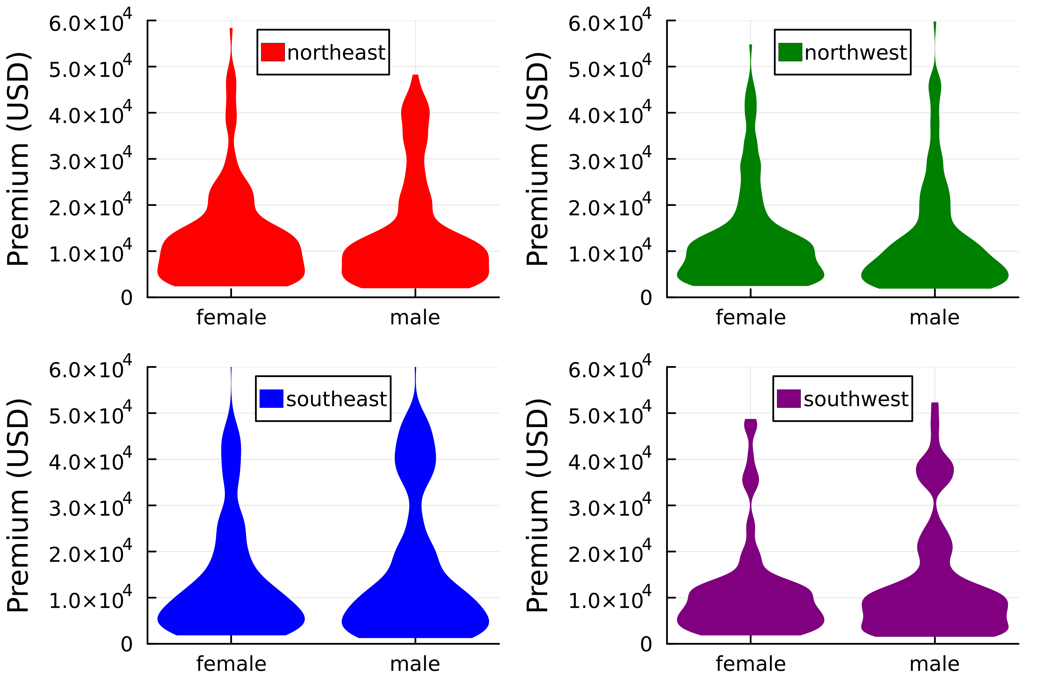
@df insurance violin(
    :Sex,
    :Charges,
    group=:Region,
    linewidth=0,
    color=[:red :green :blue :purple],
    legend_position=:top,

# Set layout layout=(2,2)
) ylims!(0, 6*10^4) ylabel!("Premium (USD)")

二乘二格狀圖,顯示各區域按性別的保險費分布盒鬚圖。

Julia 資料視覺化入門

把鏈結語法一起用上

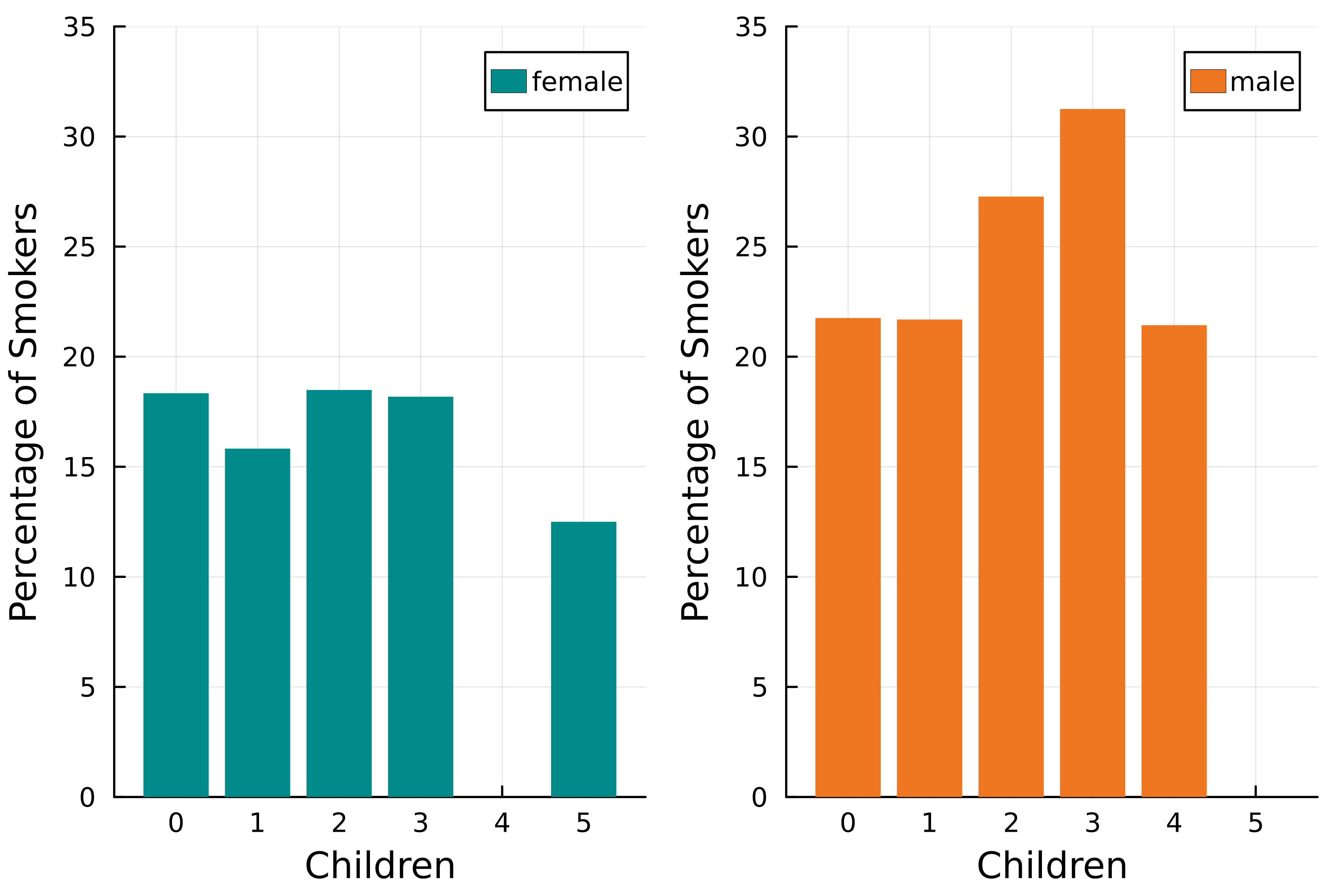
@chain insurance begin
    # Smoker column to numeric
    transform(:Smoker
        => ByRow(x -> x == "yes" ? 100 : 0)
        => :Smoker)

groupby([:Sex, :Children]) combine(:Smoker => mean)
@df bar(:Children, :Smoker_mean, group=:Sex, linewidth=0, fillcolor=[:cyan4 :chocolate2], # Set layout layout=2)
end ylims!(0, 35) xlabel!("Children") ylabel!("Percentage of Smokers")

一乘二的長條圖格狀圖,顯示吸菸者比例與子女數的關係。

Julia 資料視覺化入門

相關矩陣圖

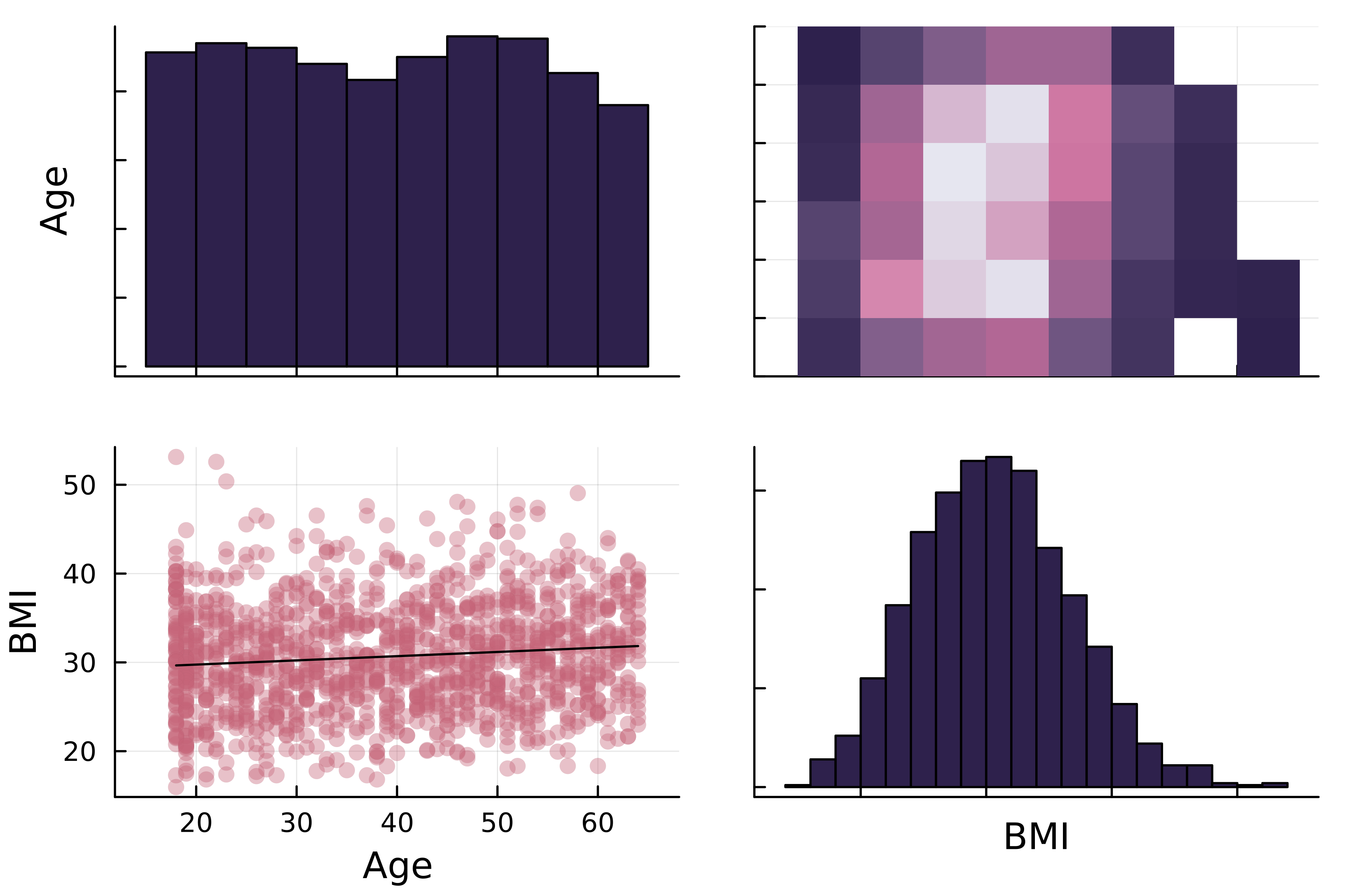
二乘二相關矩陣圖。對角線為年齡與 BMI 的直方圖;主對角線上方為年齡對 BMI 的二維直方圖;下方為相同變數的散佈圖。

Julia 資料視覺化入門

相關矩陣圖

二乘二相關矩陣圖。對角線為年齡與 BMI 的直方圖;主對角線上方為年齡對 BMI 的二維直方圖;下方為相同變數的散佈圖。

  • 對角線

    • 變數分布的直方圖
  • 對角線上方

    • 二維直方圖
  • 對角線下方

    • 含迴歸線的散佈圖
Julia 資料視覺化入門

StatsPlots.jl 的相關矩陣圖

# Using DataFrames recipe
@df insurance corrplot(

# Numerical columns [:Age :BMI],
# Customize markercolor=:thermal, fillcolor=:acton )

二乘二相關矩陣圖。對角線為年齡與 BMI 的直方圖;主對角線上方為年齡對 BMI 的二維直方圖;下方為相同變數的散佈圖。

1 https://docs.juliaplots.org/latest/generated/colorschemes/
Julia 資料視覺化入門

StatsPlots.jl 的相關矩陣圖

# Using DataFrames recipe
@df insurance corrplot(
    # Numerical columns
    [:Age :BMI :Children :Charges],

# Customize markercolor=:thermal, fillcolor=:acton )

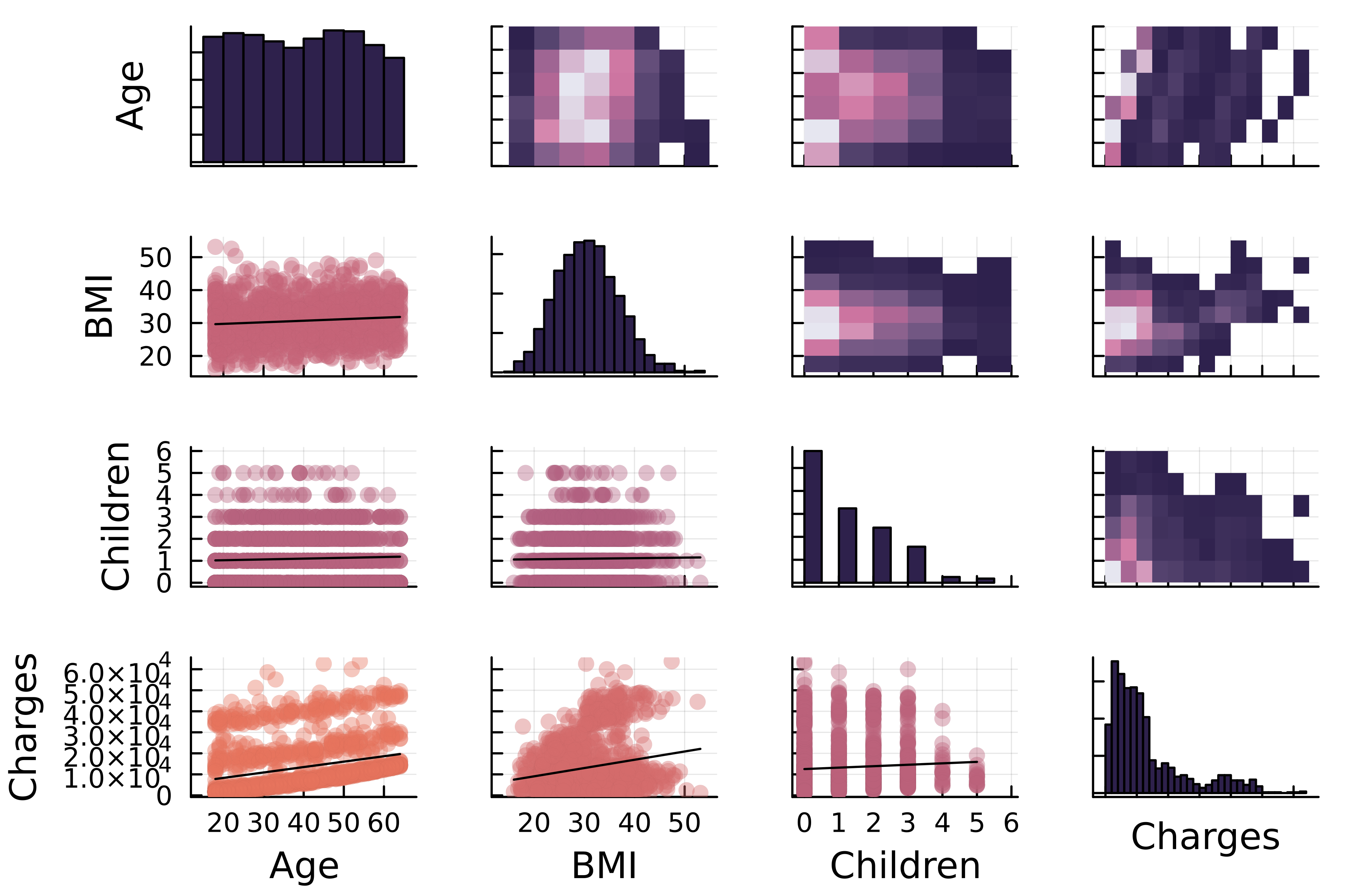
年齡、BMI、子女數與保險費的相關矩陣圖。

Julia 資料視覺化入門

一起來練習吧!

Julia 資料視覺化入門

Preparing Video For Download...