Julia 資料視覺化入門
Gustavo Vieira Suñe
Data Analyst
tomato
tomato.Date = sort(
  tomato.Date, :Date
)
# 繪製時間序列
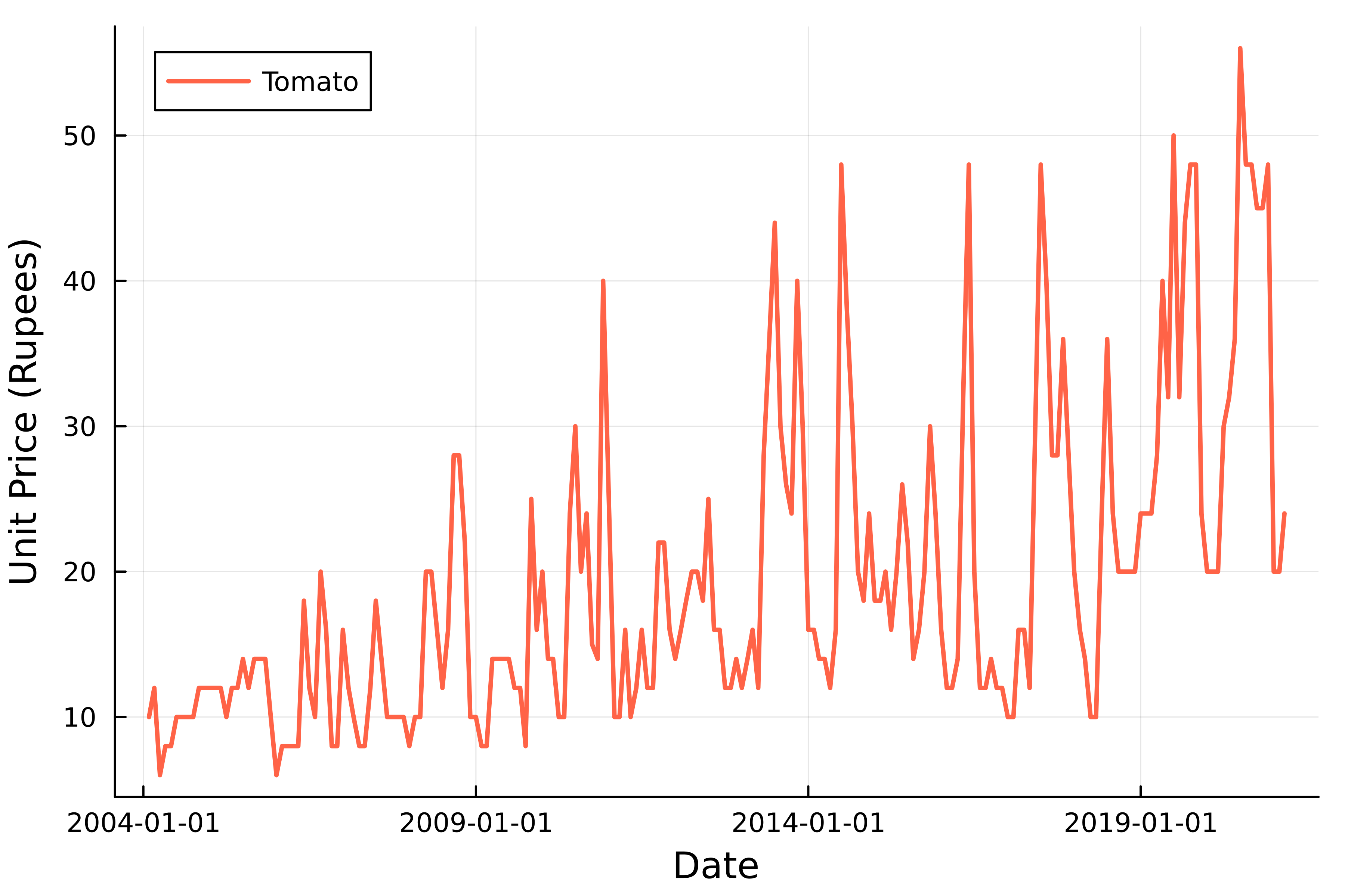
plot(
    tomato.Date,
    tomato.Price,

    # 自訂圖表
    linewidth=2,
    linecolor=:tomato,
    label="Tomato"
)
xlabel!("Date")
ylabel!("Unit Price (Rupees)")
# 繪製時間序列 plot( tomato.Date, tomato.Price,
# 自訂圖表 linewidth=2, linecolor=:tomato, label="Tomato" ) xlabel!("Date") ylabel!("Unit Price (Rupees)")
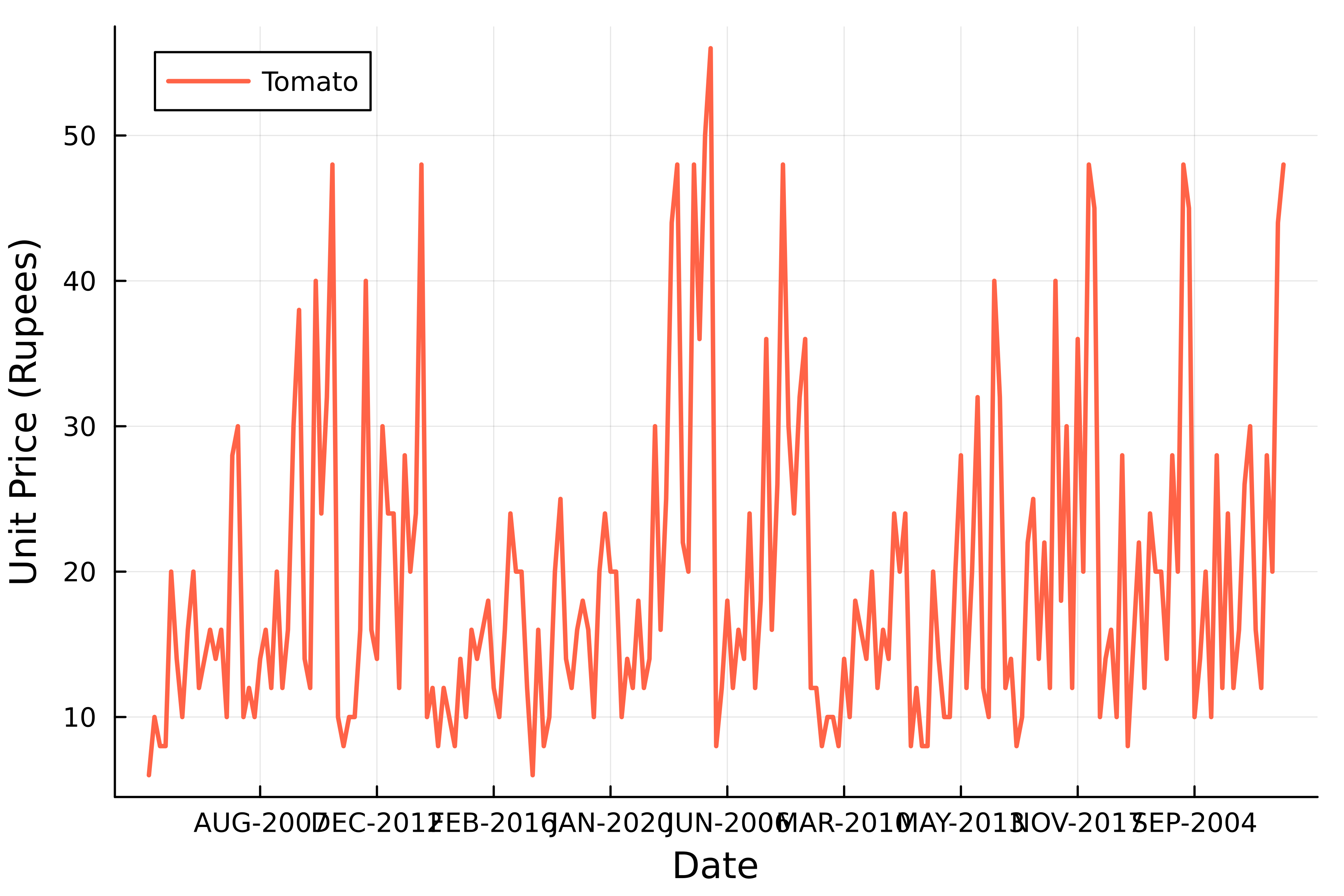
using Dates

birthday = Date("1989-12-04")
birthday = Date(
    "1989/DEC/04", dateformat"y/u/d"
)
birthday = Date(
    "Dec 4, 1989", dateformat"u d, y"
)
tomato.Date = Date.(
    tomato.Date, dateformat"u-y"
)
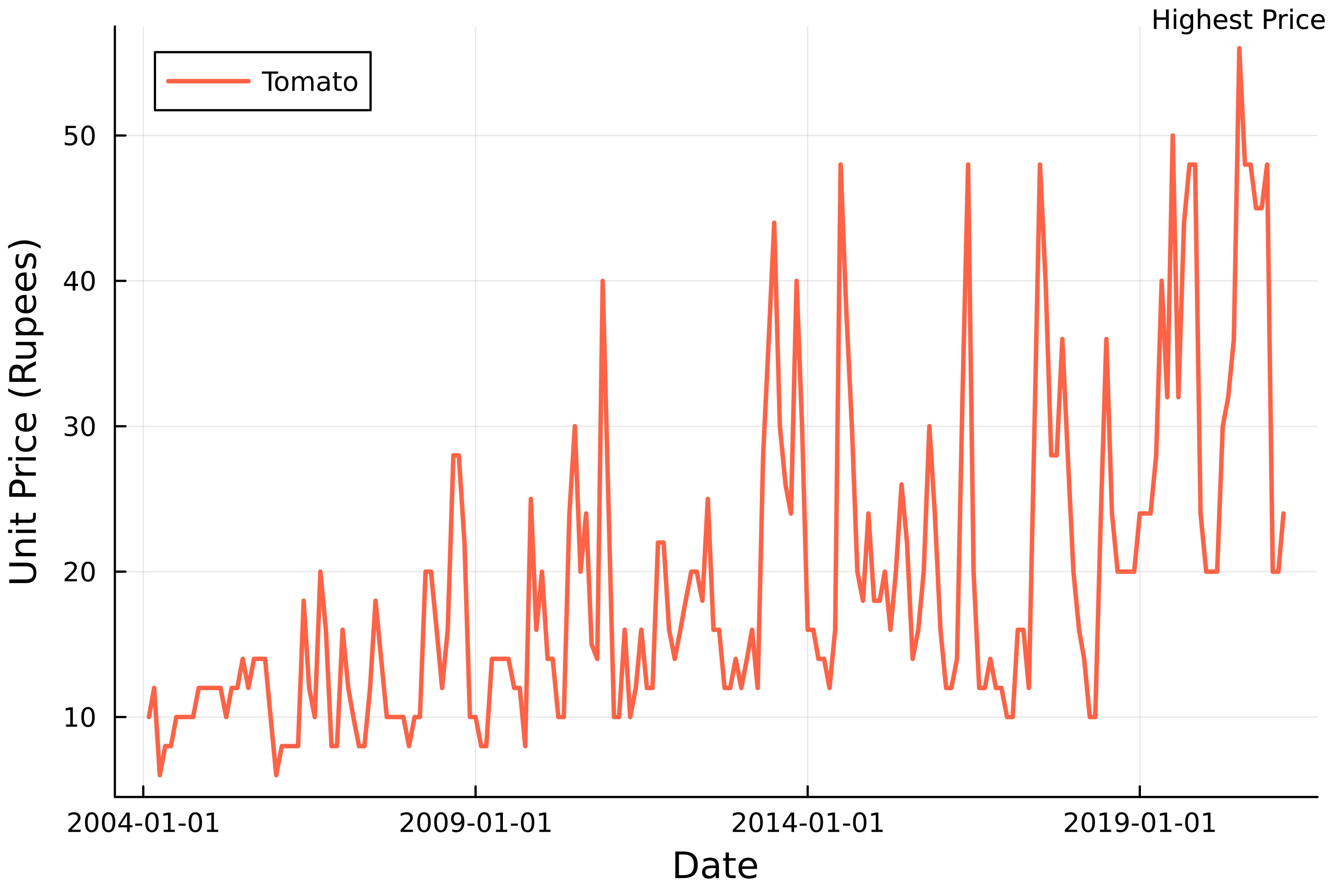
# 最高價格的列
maximum_price = tomato[
    argmax(tomato.Price), :]

# 加上註解
annotate!(
    # 座標
    maximum_price.Date,
    maximum_price.Price + 2,

    # 註解文字
    "Highest Price",
    annotationfontsize=8
)
# 最高價格的列 maximum_price = tomato[ argmax(tomato.Price), :]
# 加上註解 annotate!( # 座標 maximum_price.Date, maximum_price.Price + 2,
# 註解文字 "Highest Price", annotationfontsize=8 )