圖表屬性與調色盤

Julia 資料視覺化入門

Gustavo Vieira Suñe

Data Analyst

調色盤

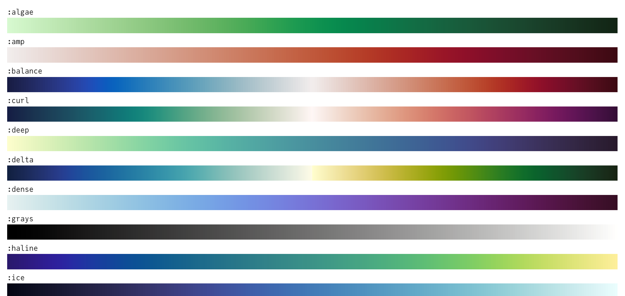
  • 多種調色盤,包括

預覽多種 Julia 調色盤的圖。

1 https://juliagraphics.github.io/ColorSchemes.jl/stable/catalogue/
Julia 資料視覺化入門

使用調色盤

# Set the theme
theme(:bright)


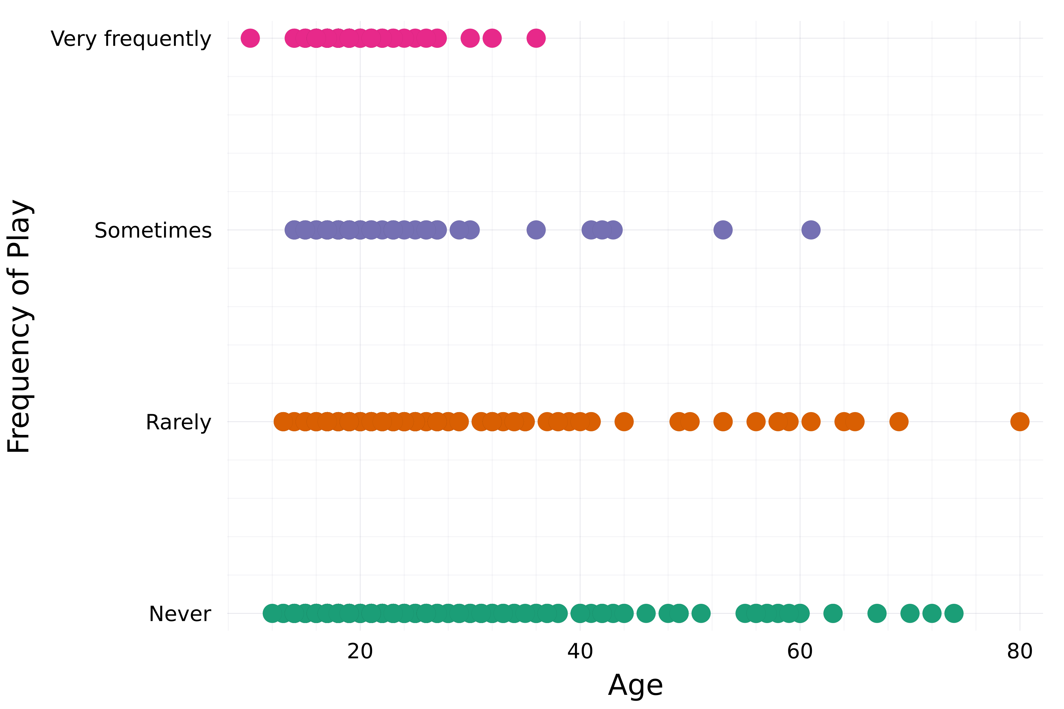
# Create a scatter plot scatter( streaming.Age, streaming."Frequency [K pop]", group=streaming."Frequency [K pop]", label=false,
# Set color palette palette=:Dark2_5 )
xlabel!("Age") ylabel!("Frequency of Play")

散佈圖:受訪者收聽 K-Pop 的頻率與年齡。

Julia 資料視覺化入門

圖表屬性

之前看過:

  • title, xlabel, ylabel
  • xticks, yticks
  • color
  • linecolor, linewidth
  • markercolor
  • framestyle

更多屬性:

  • xlims, ylims
  • alpha
  • linestyle
  • legend_title, legend_position
  • markersize, markershape

...

1 https://docs.juliaplots.org/stable/attributes/#attributes
Julia 資料視覺化入門

標記屬性

theme(:bright)

scatter(
    streaming.Age,
    streaming."Frequency [K pop]",
    group=streaming."Frequency [K pop]",
    label=false,
    palette=:Dark2_5

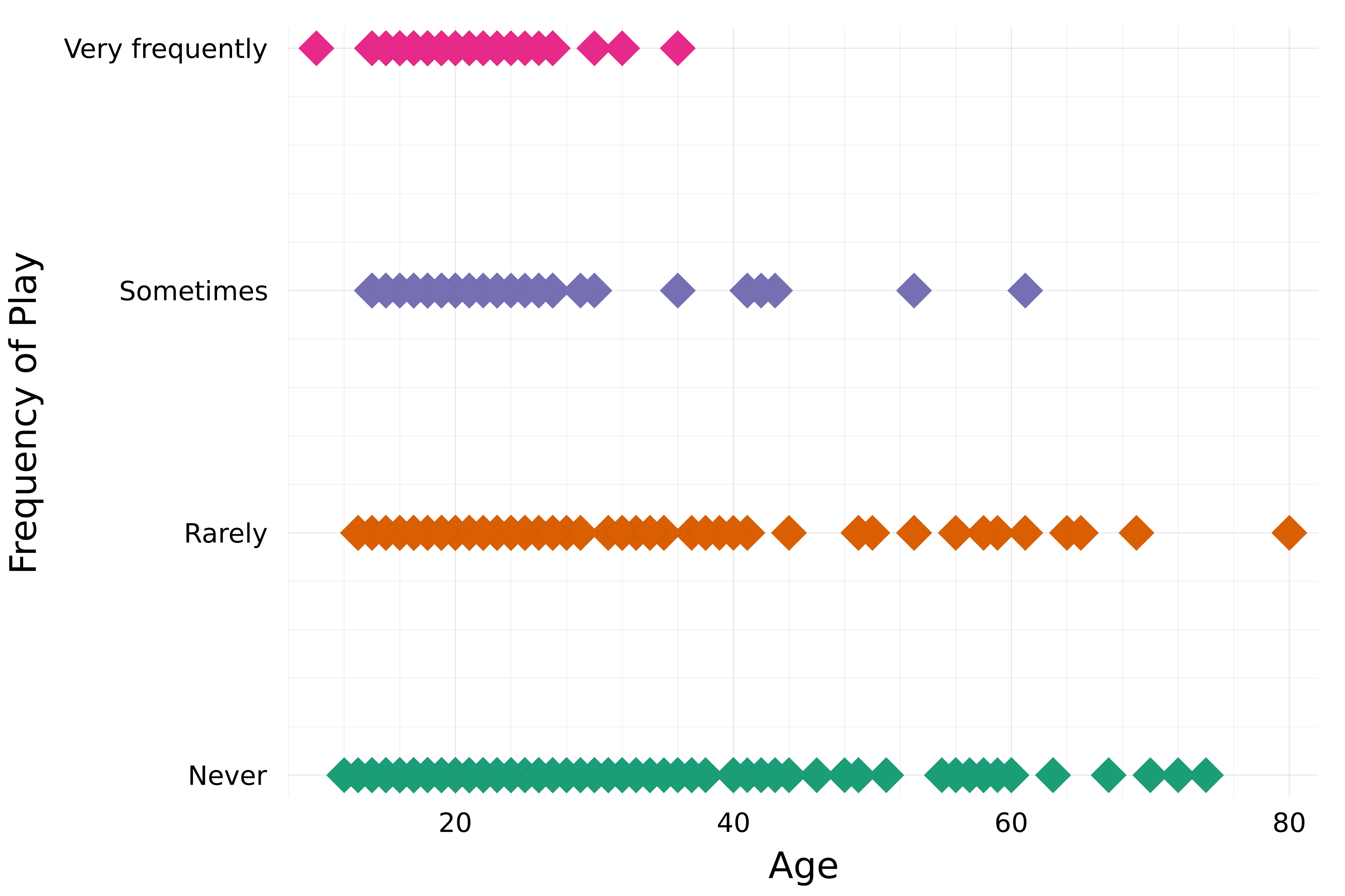
# Marker attributes markershape=:diamond, markersize=8, )
xlabel!("Age") ylabel!("Frequency of Play")

散佈圖:受訪者收聽 K-Pop 的頻率與年齡,標記為大型菱形。

Julia 資料視覺化入門

不透明度/透明度

theme(:bright)

scatter(
    streaming.Age,
    streaming."Frequency [K pop]",
    group=streaming."Frequency [K pop]",
    label=false,
    palette=:Dark2_5
    markershape=:diamond,
    markersize=8,

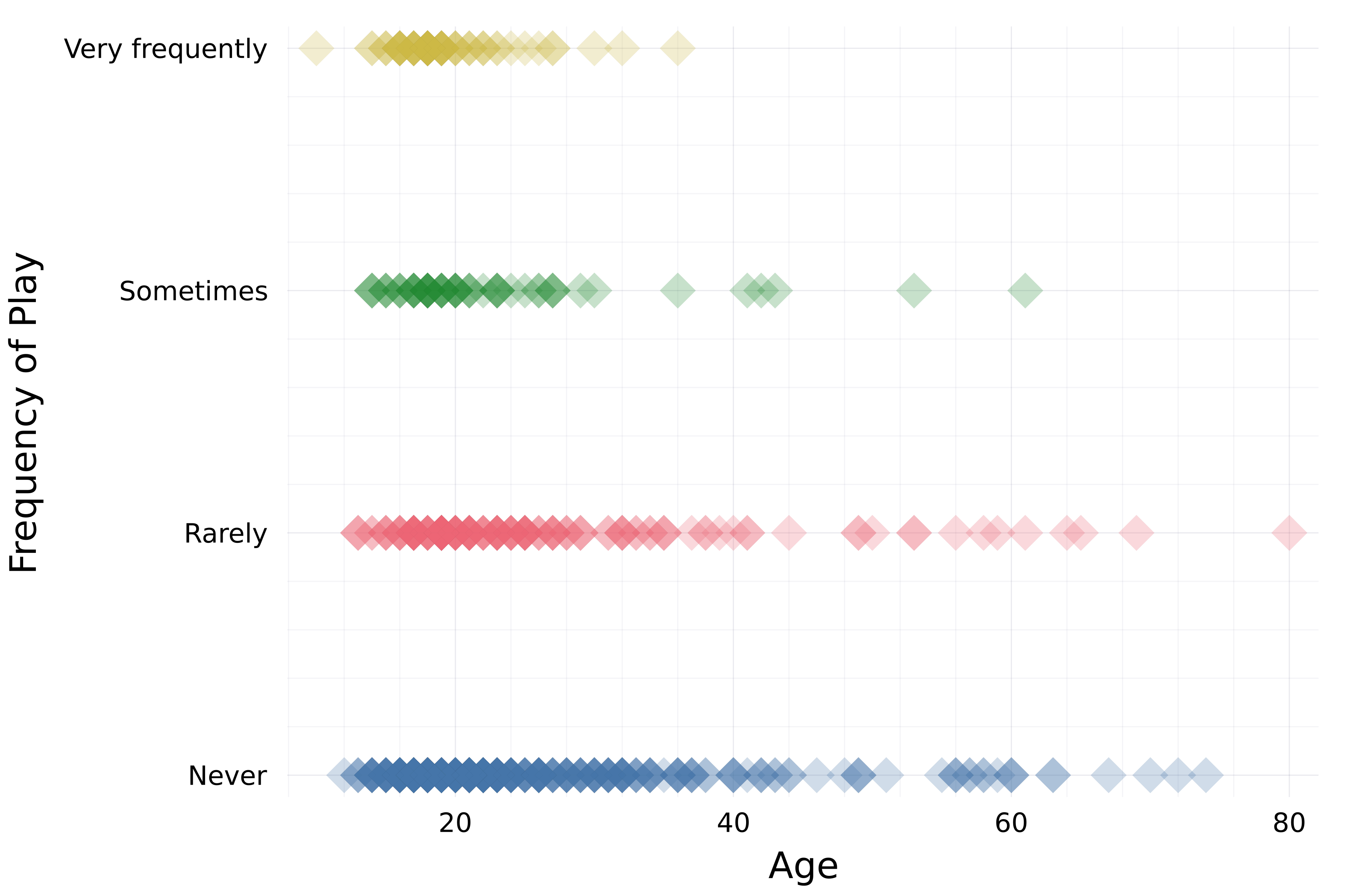
# Opacity alpha=0.25 )
xlabel!("Age") ylabel!("Frequency of Play")

散佈圖:受訪者收聽 K-Pop 的頻率與年齡,標記為大型菱形並帶透明度。

Julia 資料視覺化入門

線條屬性

# Set theme and default line width
theme(:dao, linewidth=4)

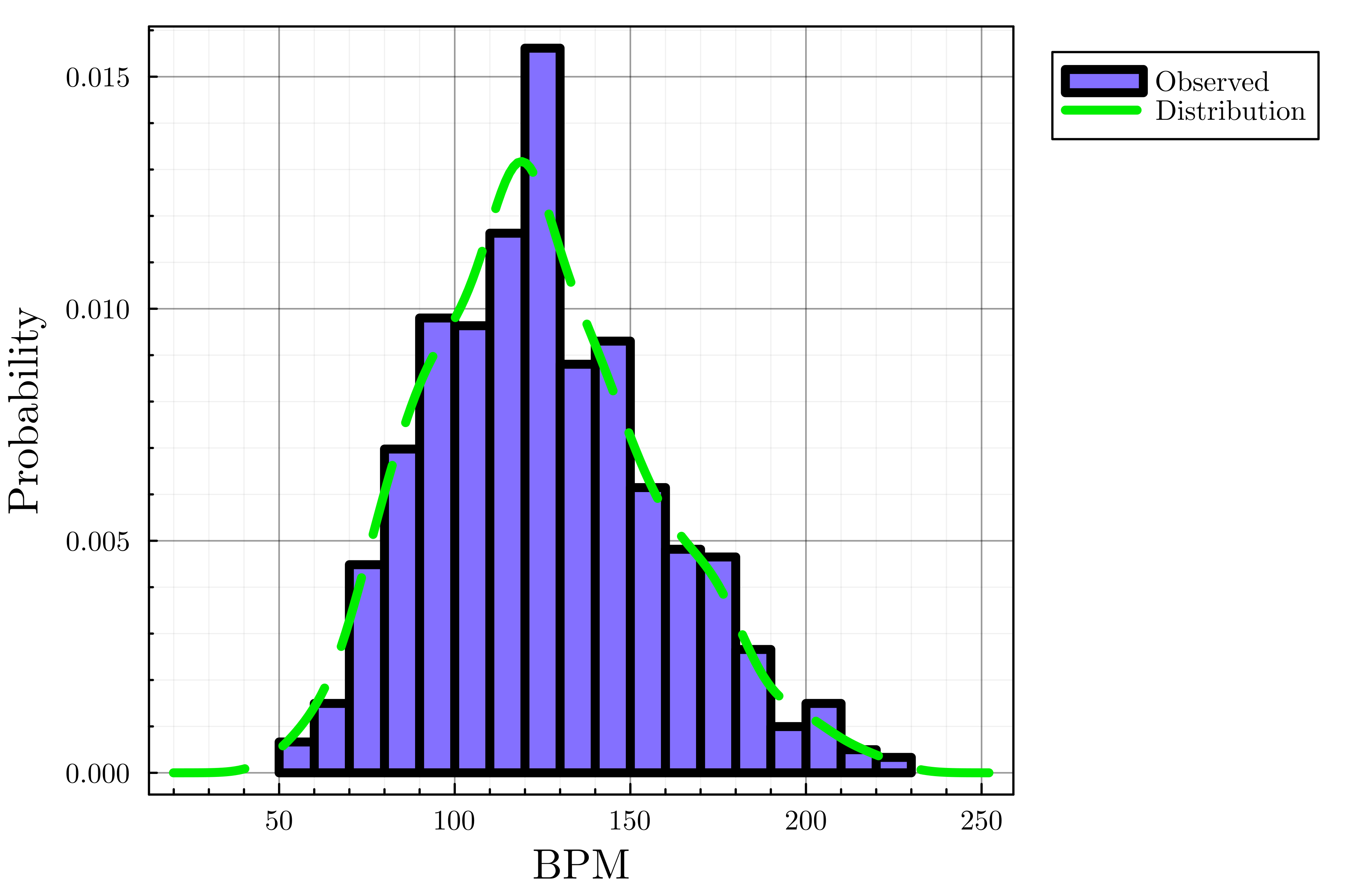
# Create histogram histogram(streaming.BPM, label="Observed", color=:lightslateblue, normalize=true)
# Add density plot density!(streaming.BPM, label="Distribution", linecolor=:green2,
# Line style linestyle=:dash)
xlabel!("BPM") ylabel!("Probability")

常態化直方圖:受訪者偏好的每分鐘節拍數,並加上機率密度曲線以呈現估計分布。

Julia 資料視覺化入門

座標範圍與圖例屬性

theme(:dao, linewidth=4)

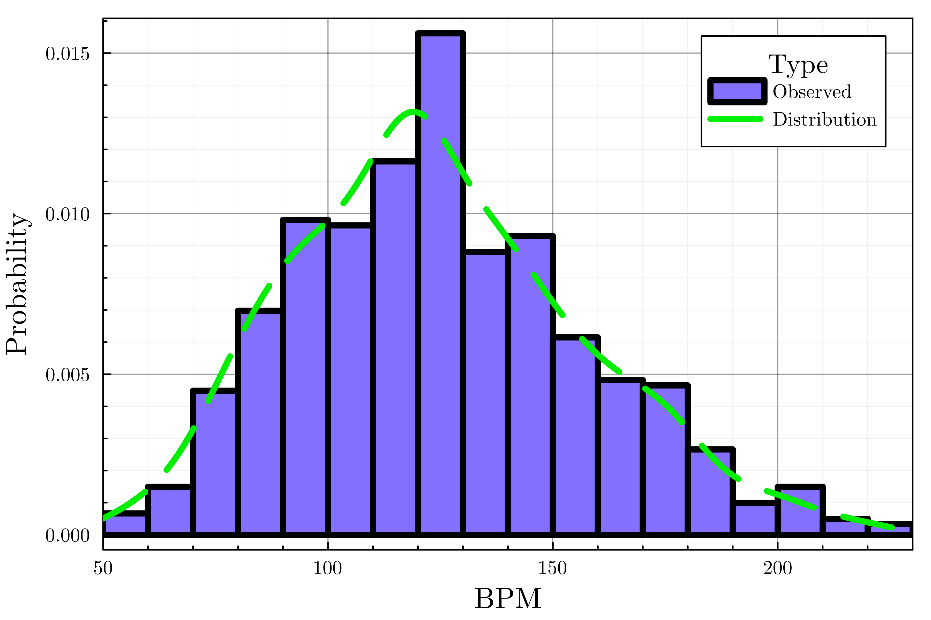
histogram(streaming.BPM, label="Observed", 
    color=:lightslateblue, normalize=true)
density!(streaming.BPM, label="Distribution",
    linecolor=:green2, linestyle=:dash

# Customize legend legend_title="Type", legend_position=:topright)
# Set the x-axis bounds xlims!(50, 230)
xlabel!("BPM") ylabel!("Probability")

常態化直方圖:受訪者偏好的每分鐘節拍數,並加上機率密度曲線以呈現估計分布。

Julia 資料視覺化入門

小抄總結

  • 調色盤
    • plot(..., palette=palette_symbol)
  • 標記屬性
    • markersize
    • markershape

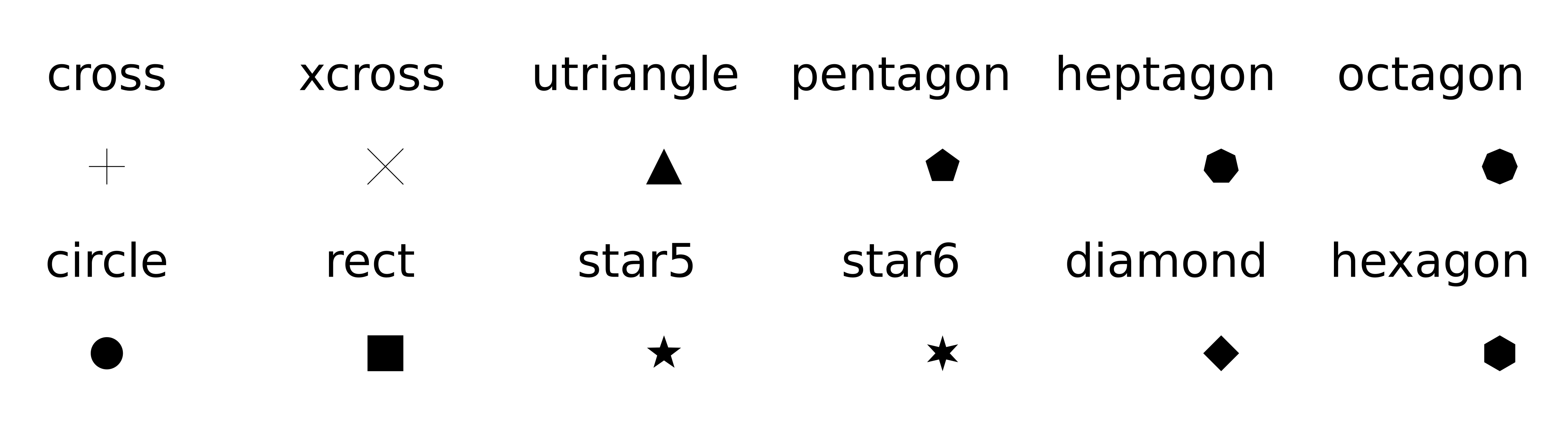
預覽 Plots.jl 可用標記形狀的圖。

  • 透明度:alpha=opacity_value
  • 座標範圍:xlims!(), ylims!()
  • 線條屬性:linetyle 預覽 Plots.jl 可用線條樣式的圖。

  • 圖例屬性

    • legend_title
    • legend_position:right, :left, :top, :bottom, :topright, :topleft, ...)
Julia 資料視覺化入門

一起來練習吧!

Julia 資料視覺化入門

Preparing Video For Download...