# Plot a histogram
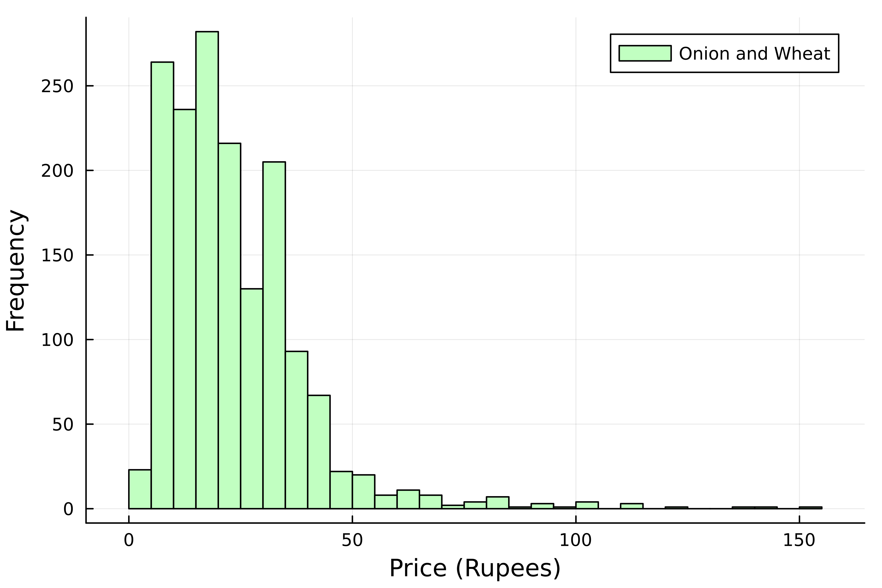
histogram(
    kerala[:, :Price],

    # Add a label
    label="Onion and Wheat",
    # Choose bar color
    color=:darkseagreen1,
)

# Add axis labels
xlabel!("Price (Rupees)")
ylabel!("Frequency")
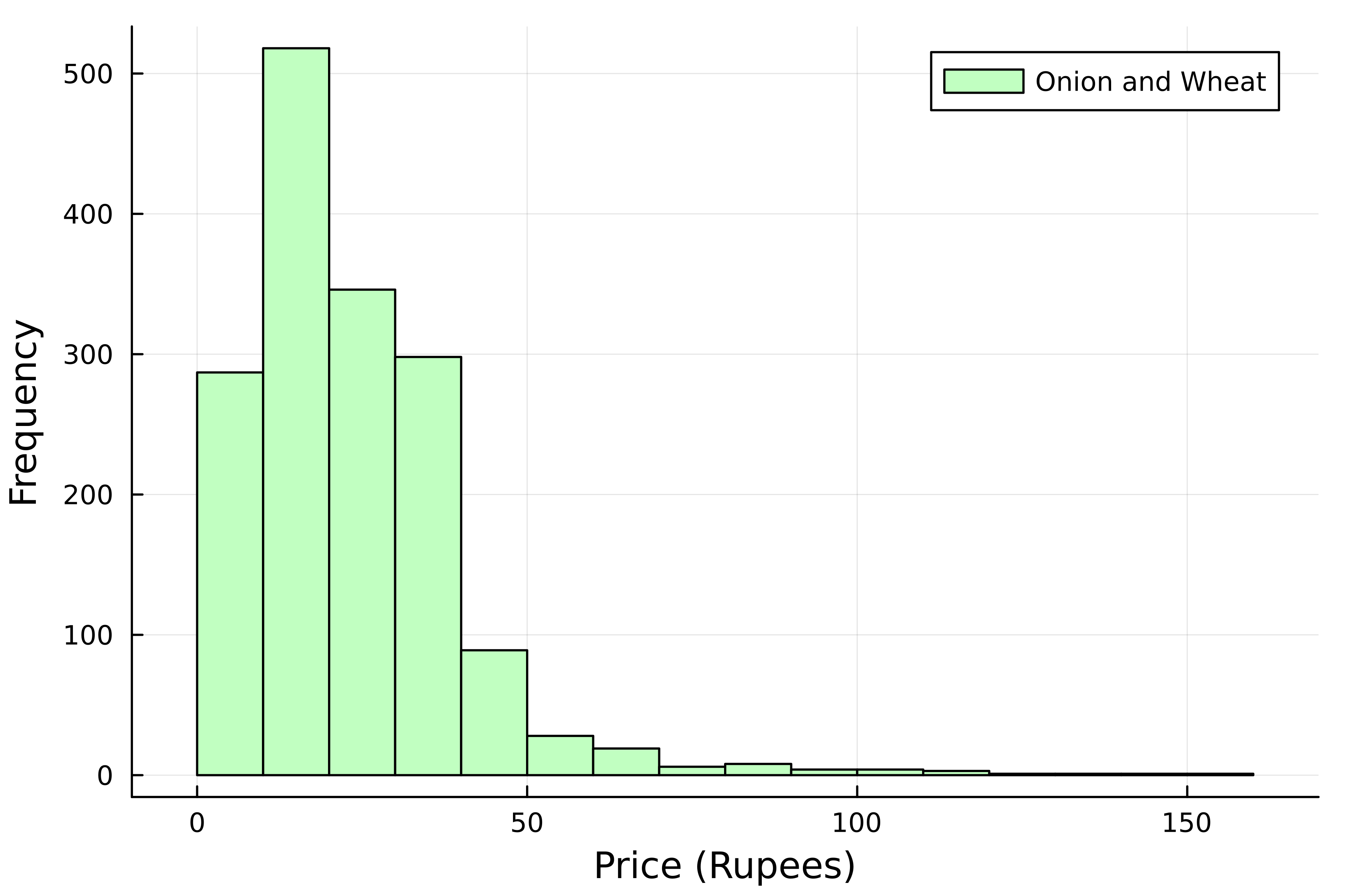
分箱數(bins)
# Plot a histogram
histogram(
    kerala[:, :Price],
    # Add a label
    label="Onion and Wheat",
    # Choose bar color
    color=:darkseagreen1,

    # Number of bins
    bins=20,
)
# Add axis labels
xlabel!("Price (Rupees)")
ylabel!("Frequency")
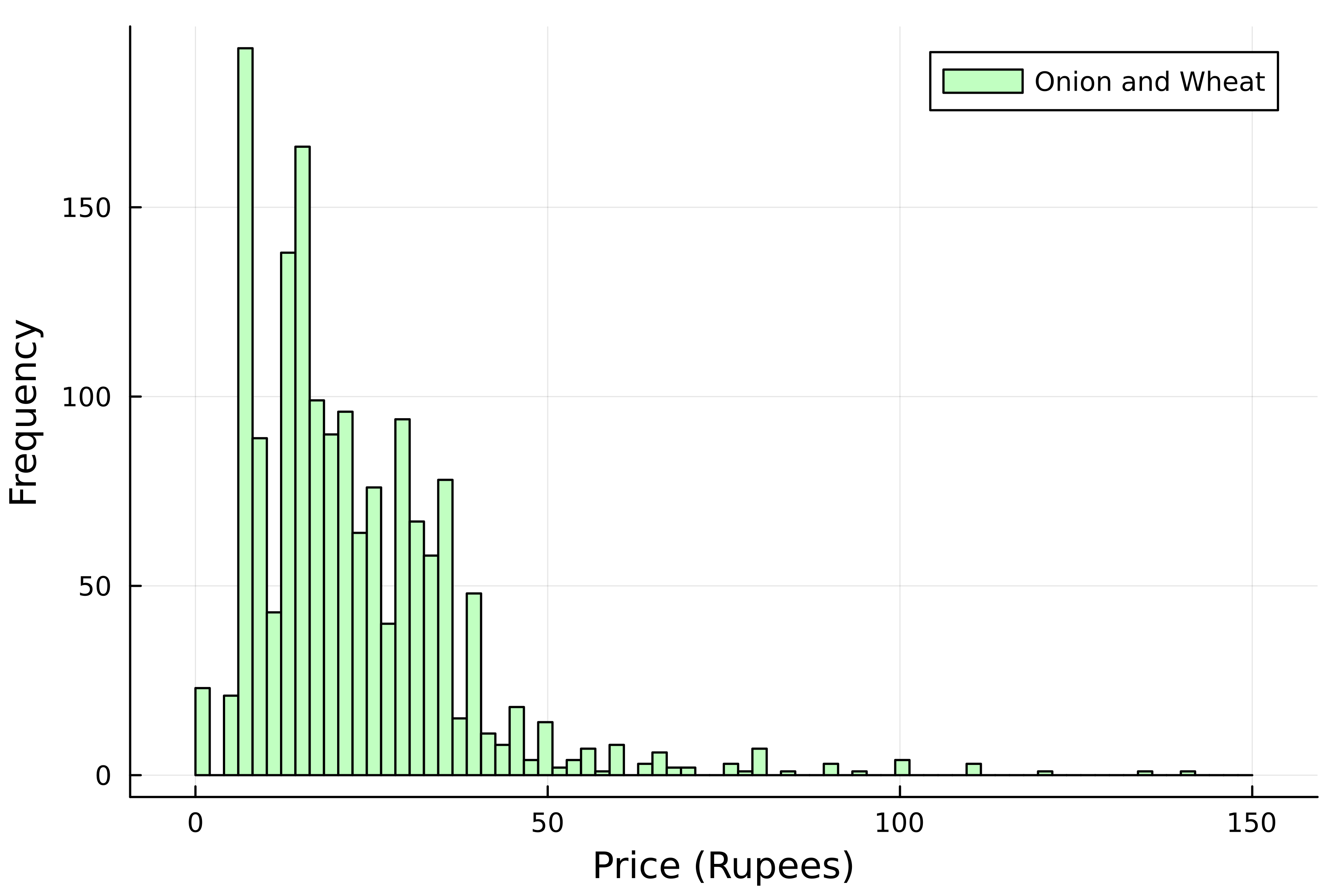
分箱數(bins)
# Plot a histogram
histogram(
    kerala[:, :Price],
    # Add a label
    label="Onion and Wheat",
    # Choose bar color
    color=:darkseagreen1,
    # Number of bins
    bins=range(0, 150, 75),
)
# Add axis labels
xlabel!("Price (Rupees)")
ylabel!("Frequency")
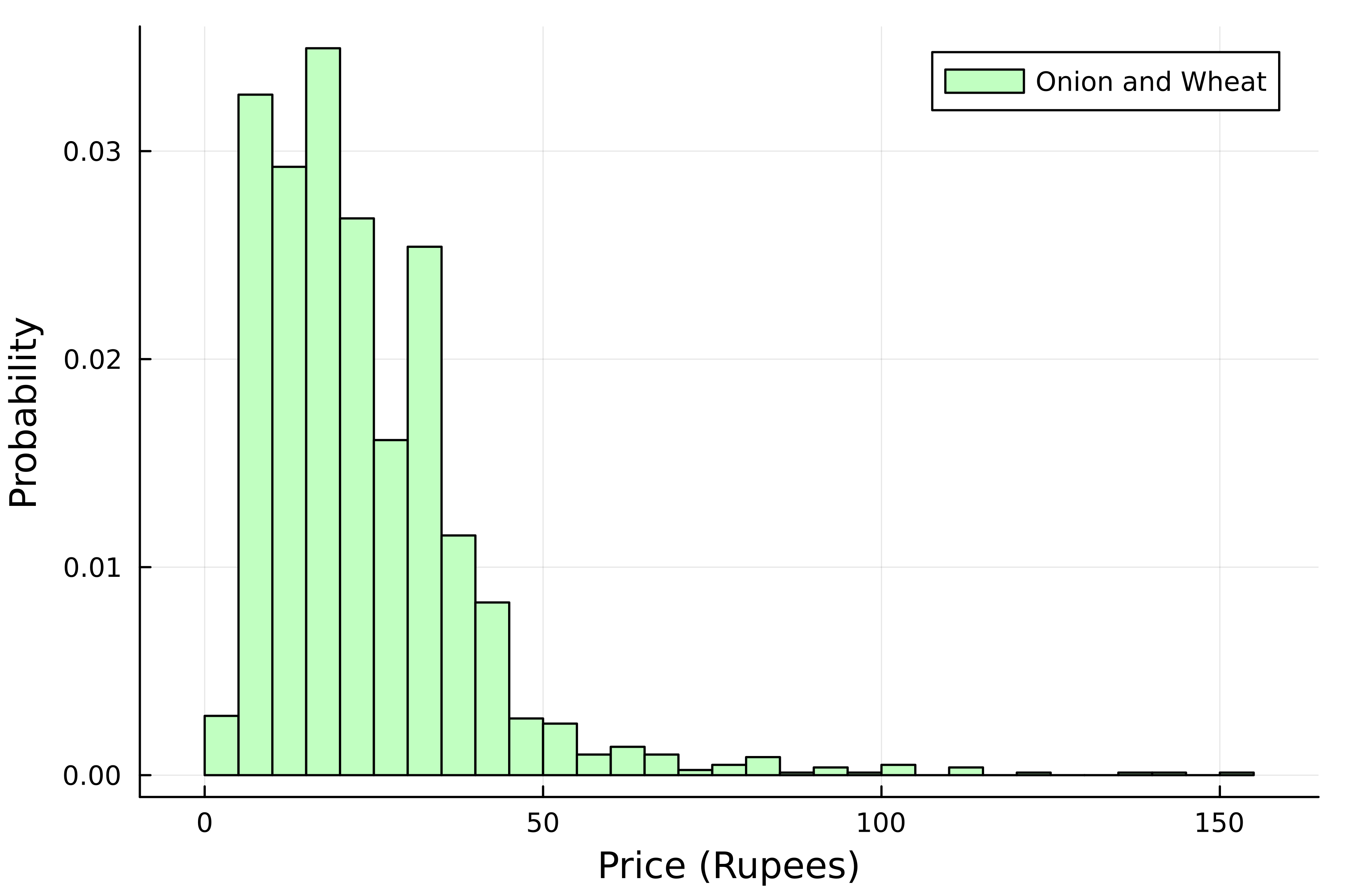
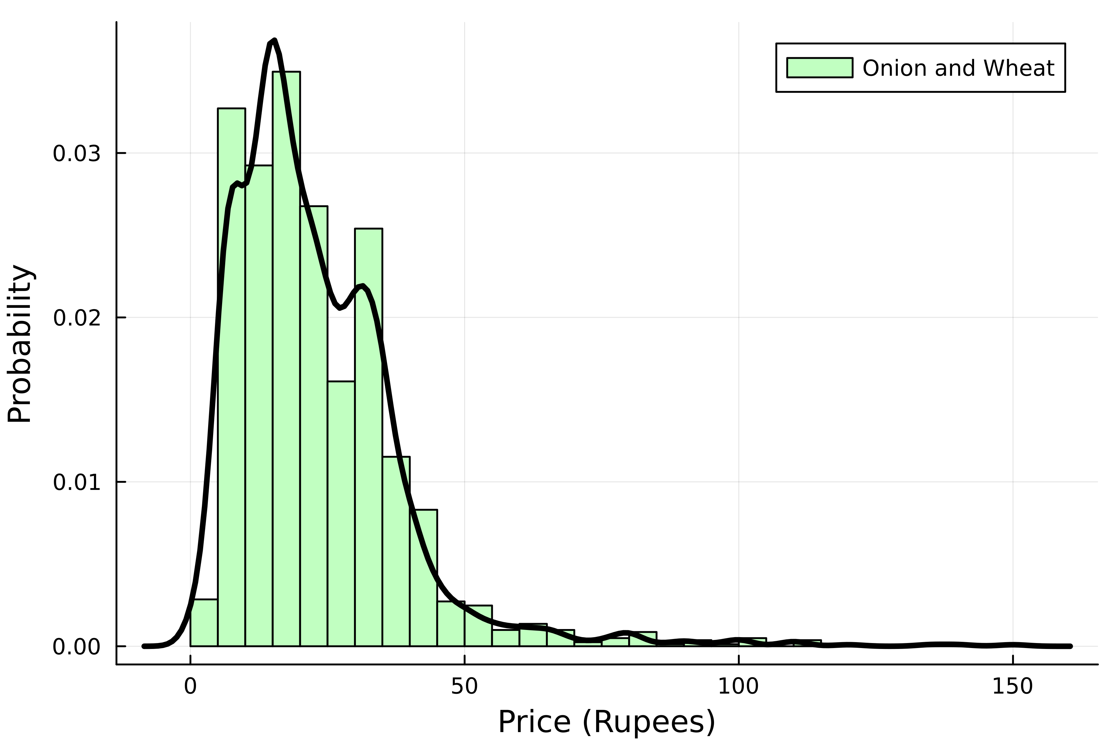
標準化直方圖
# Plot a normalized histogram
histogram(
    kerala[:, :Price],
    # Add a label
    label="Onion and Wheat",
    # Choose bar color
    color=:darkseagreen1,

    # Normalize it
    normalize=true,
)
# Add axis labels
xlabel!("Price (Rupees)")
ylabel!("Probability")
機率分佈
using StatsPlots


density!(
    kerala[:, :Price],
    color=:black,
    linewidth=3,
    label=false
)
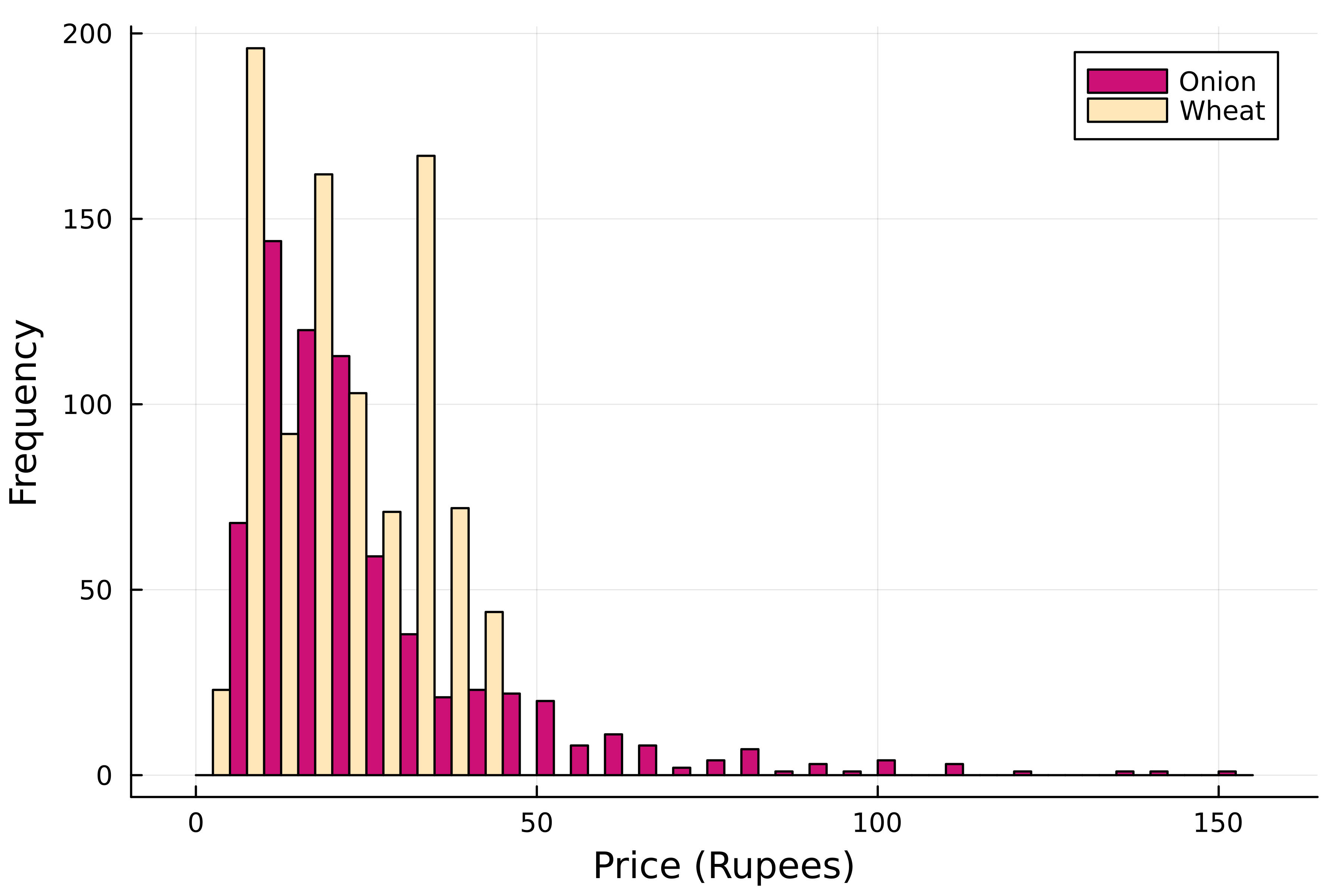
各商品的價格
using StatsPlots

# Grouped histogram
groupedhist(
    kerala[:, :Price],

    # Group by commodity
    group=kerala[:, "Commodity"],

    # Select colors
    color=[:deeppink3 :wheat2]
)
xlabel!("Price (Rupees)")
ylabel!("Frequency")
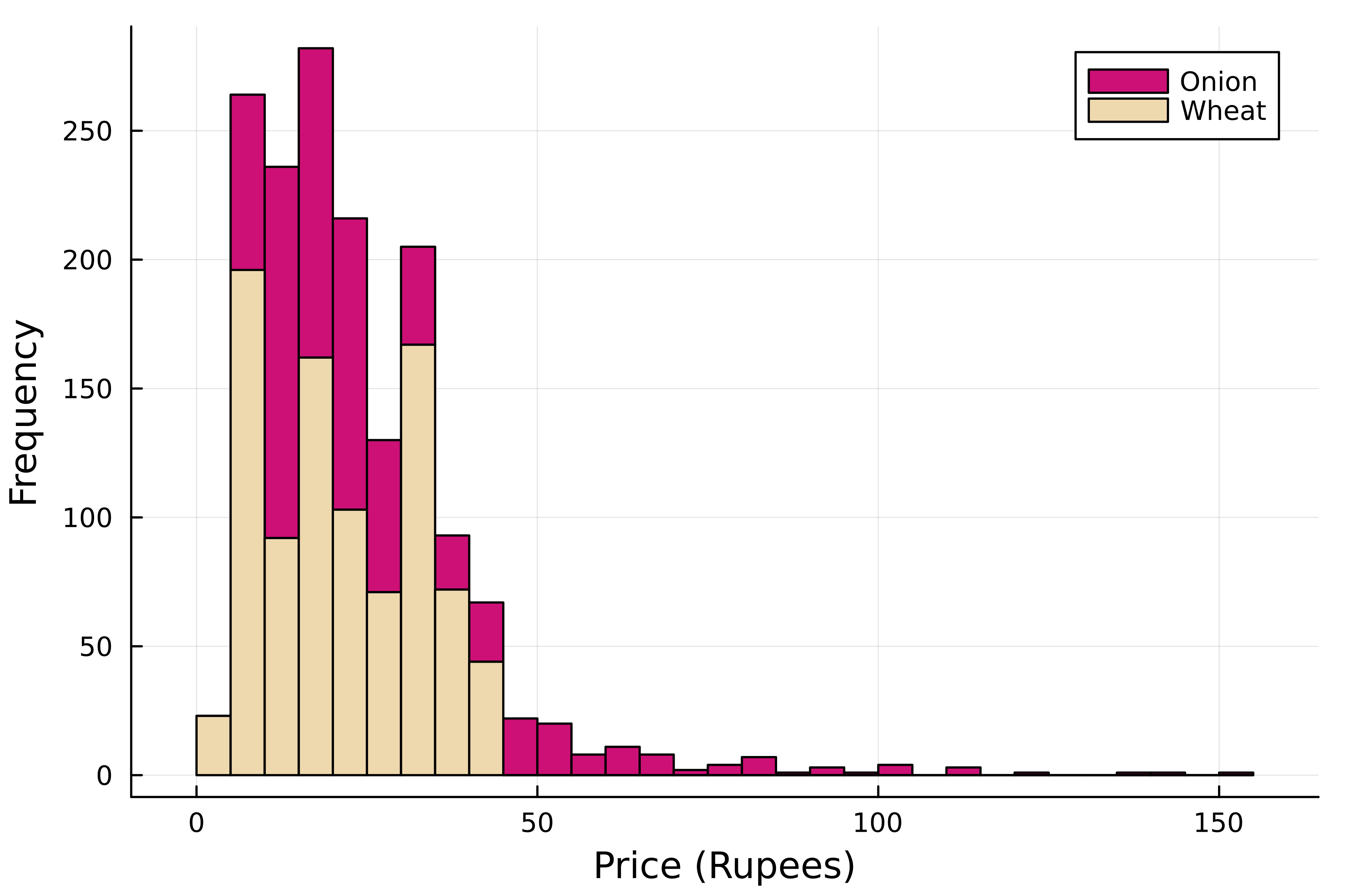
堆疊直方圖
using StatsPlots

# Stacked histogram
groupedhist(
    kerala[:, :Price],
    # Group by commodity
    group=kerala[:, "Commodity"],
    # Select colors
    color=[:deeppink3 :wheat2]

    # Stack the bars
    bar_position=:stack,
)

xlabel!("Price (Rupees)")
ylabel!("Frequency")