R 的 plotly 互動式資料視覺化:中級
Adam Loy
Statistician, Carleton College

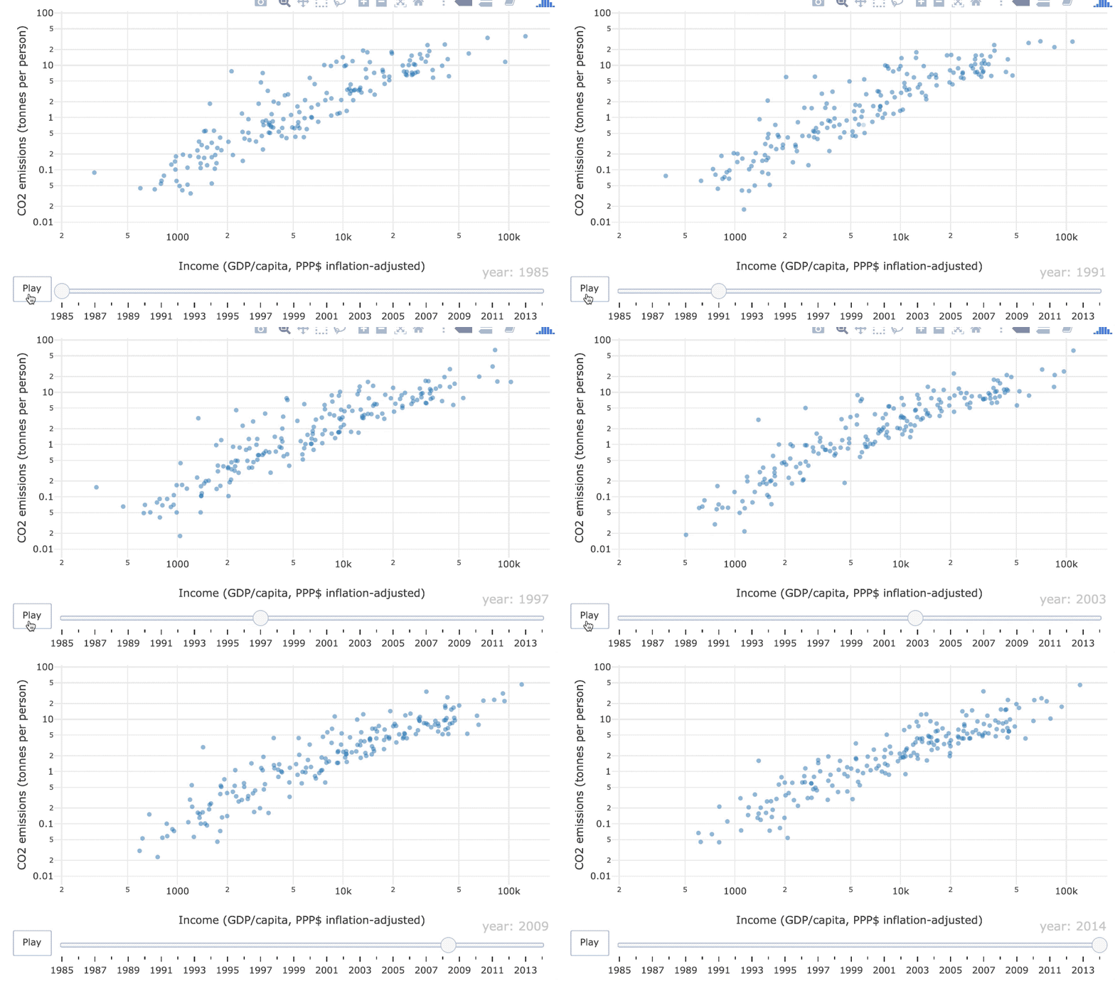
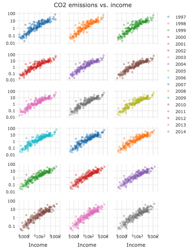
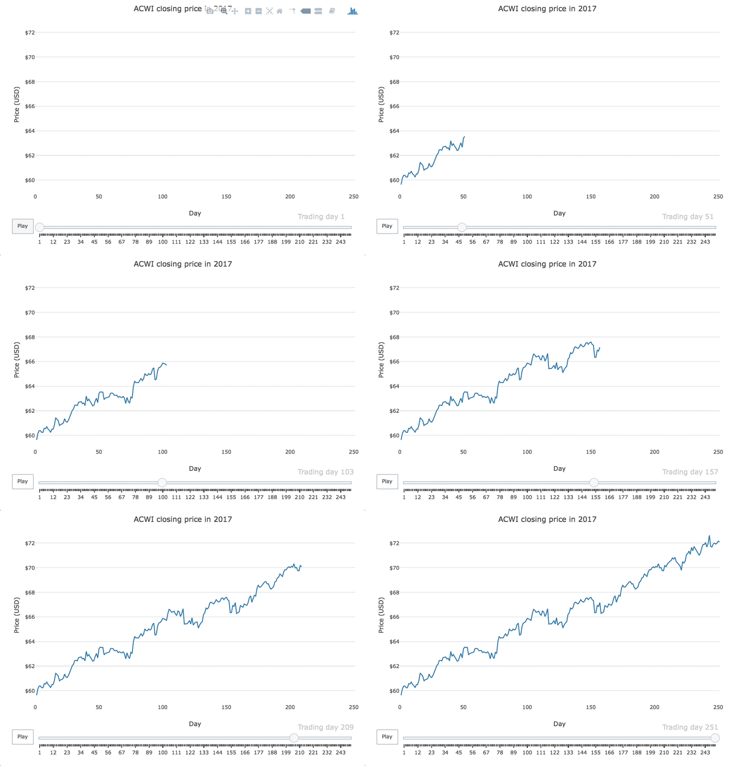
透過動畫比較容易看出隨時間的變化嗎?還是分面圖更清楚?

用於互動、動態網頁圖形的視覺化函式庫
仍在持續開發中
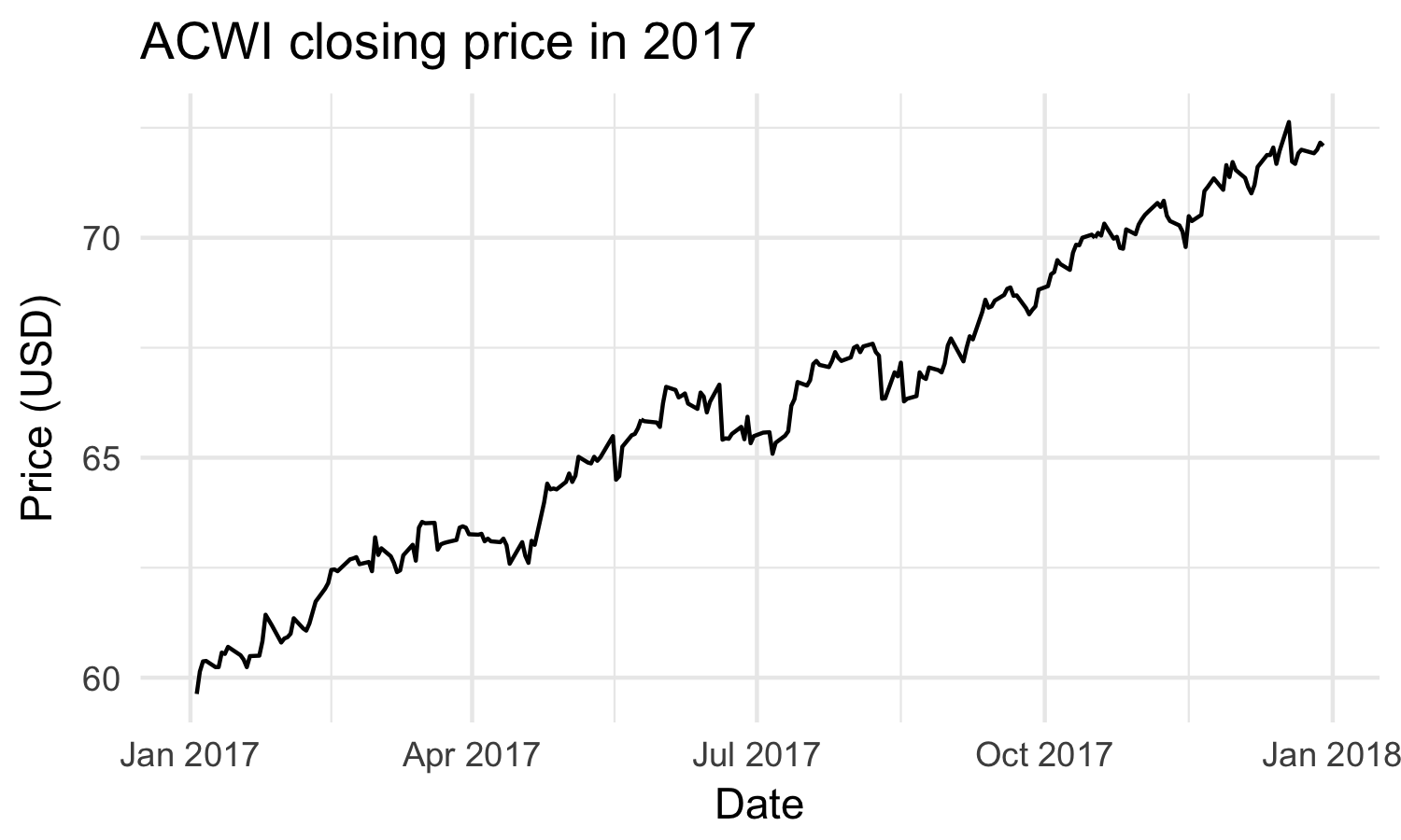
靜態
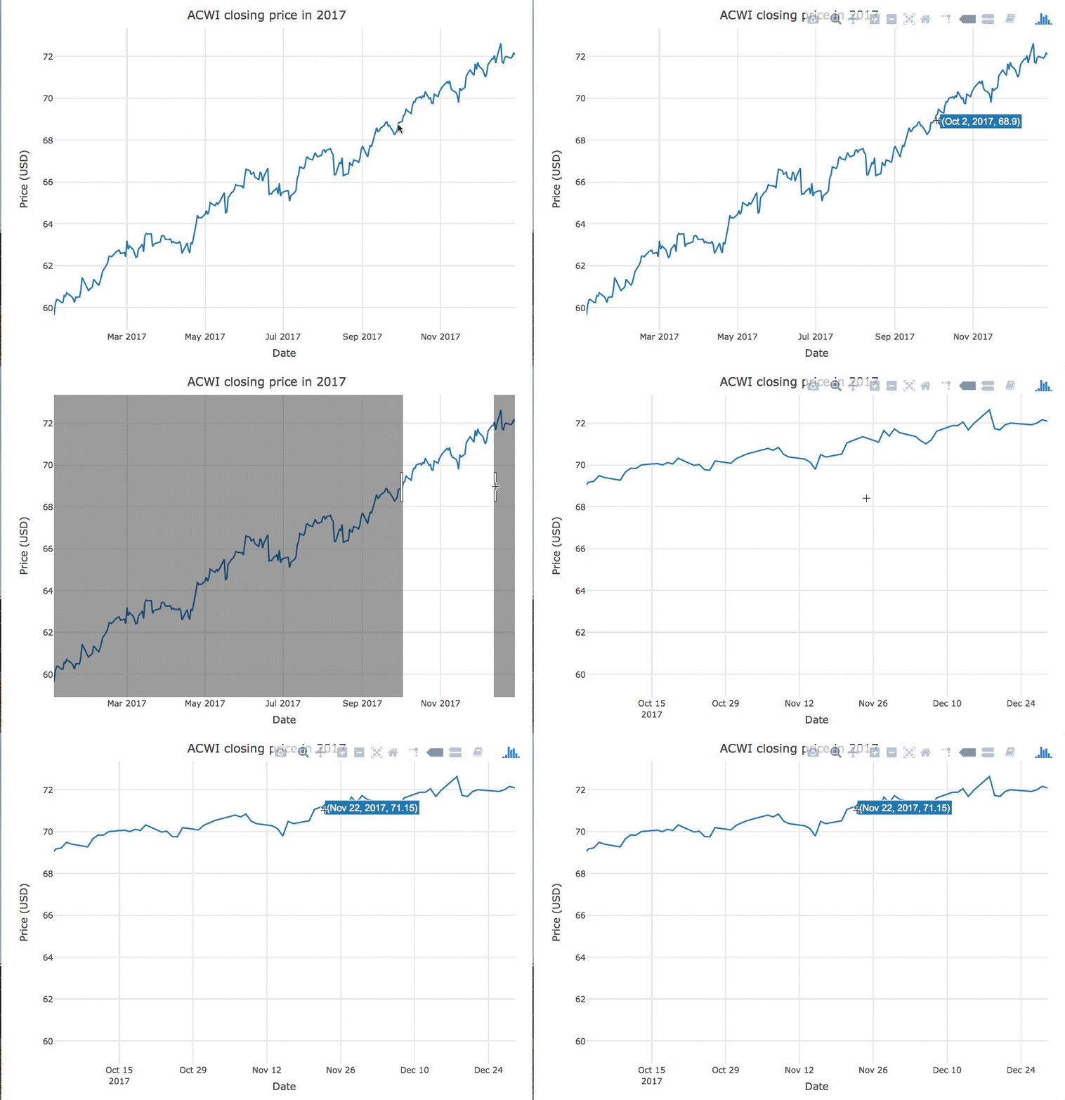
互動
動態
「靜態圖形」在建立後即固定不變。

「互動圖形」會依使用者的操作而改變。

「動態圖形」會定期變動,無需使用者輸入。

msci
# A tibble: 251 x 7
Date Open High Low Close Volume Adjusted
<date> <dbl> <dbl> <dbl> <dbl> <int> <dbl>
1 2017-01-03 79.8 79.8 78.4 78.7 646000 77.4
2 2017-01-04 79.1 81.1 79.1 80.7 849200 79.3
3 2017-01-05 80.4 81.8 80.4 81.6 557500 80.2
4 2017-01-06 81.8 83.9 81.8 83.4 597800 82.0
5 2017-01-09 83.1 83.5 82.6 82.7 668100 81.3
6 2017-01-10 82.3 82.6 81.1 81.5 558900 80.1
7 2017-01-11 81.2 81.6 80.8 81.5 365500 80.1
# ... with 244 more rows
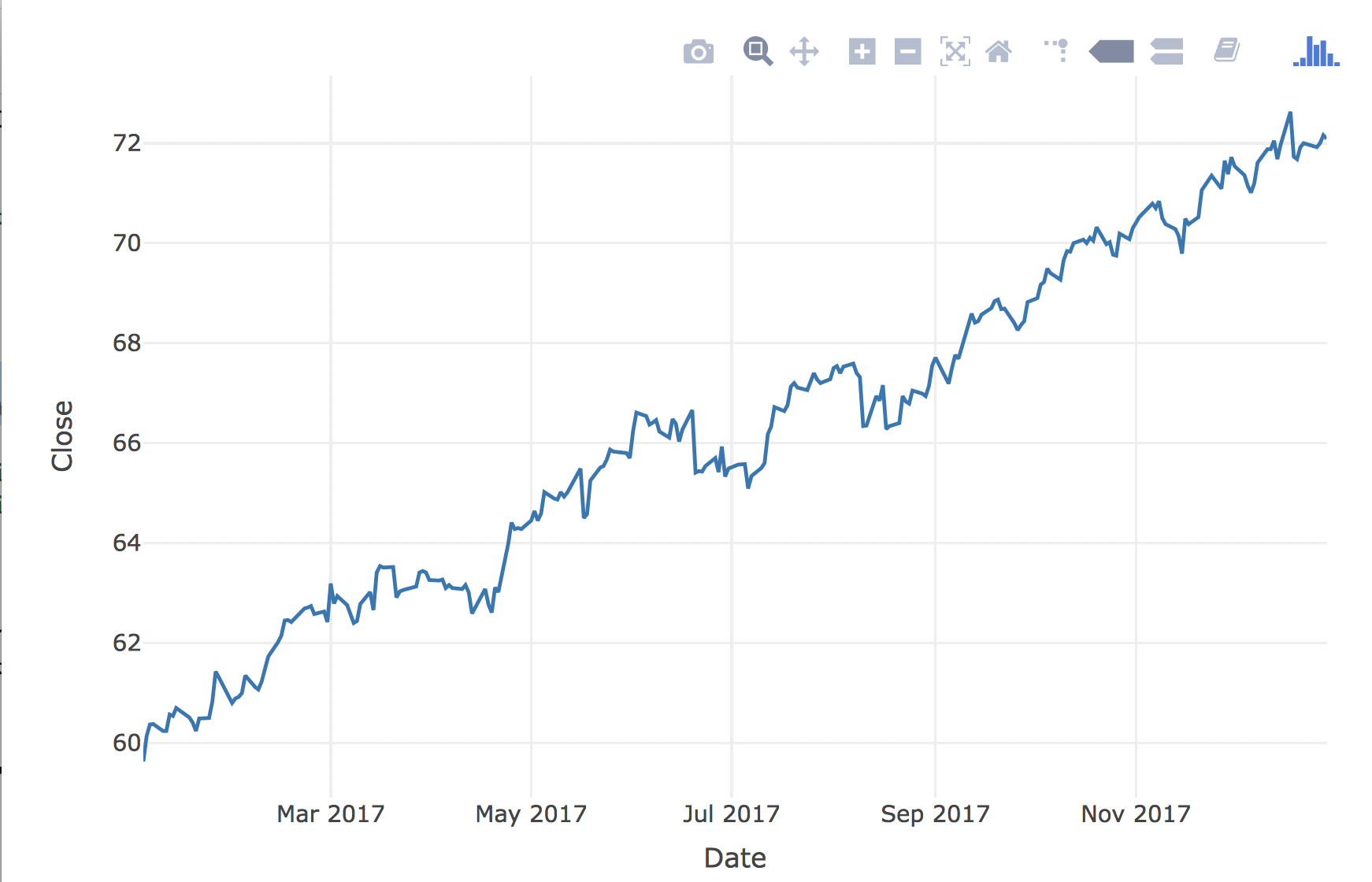
library(plotly)msci %>% plot_ly(x = ~Date, y = ~Close) %>% add_lines()

R 的 plotly 互動式資料視覺化:中級