選取策略

R 的 plotly 互動式資料視覺化:中級

Adam Loy

Statistician, Carleton College

兩種選取策略
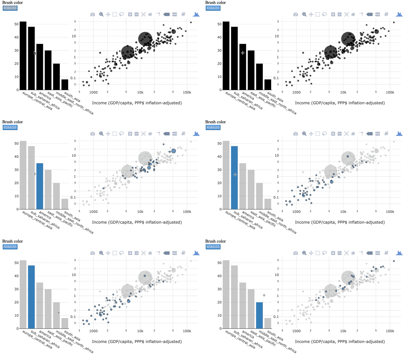
暫時選取

先前選取的案例不會保留

連結範例 1

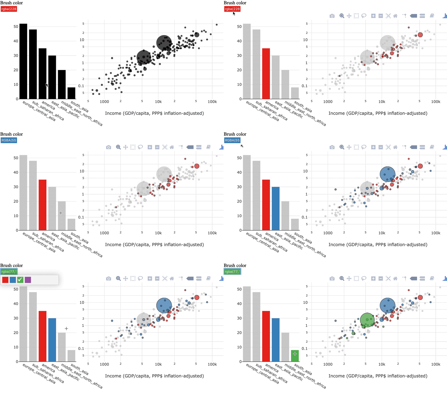
持續選取

選取的案例會累積

連結範例 2

R 的 plotly 互動式資料視覺化:中級

範例

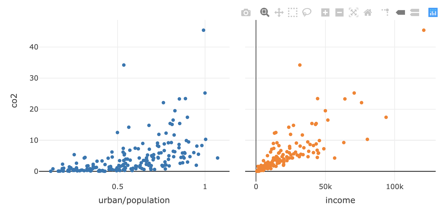
持續選取前

R 的 plotly 互動式資料視覺化:中級

產生基礎圖表

shared_data <- world2014 %>% SharedData$new()

p1 <- shared_data %>%
  plot_ly(x=~urban/population, y = ~co2, text = ~country) %>%
  add_markers()

p2 <- shared_data %>%
  plot_ly(x=~income, y = ~co2, text = ~country) %>%
  add_markers()

subplot(p1, p2, titleX = TRUE, shareY = TRUE) %>% 
  hide_legend()
R 的 plotly 互動式資料視覺化:中級

持續選取

透過 highlight() 啟用持續選取

subplot(p1, p2, titleX = TRUE, shareY = TRUE) %>% 
  hide_legend() %>%
  highlight(persistent = TRUE)
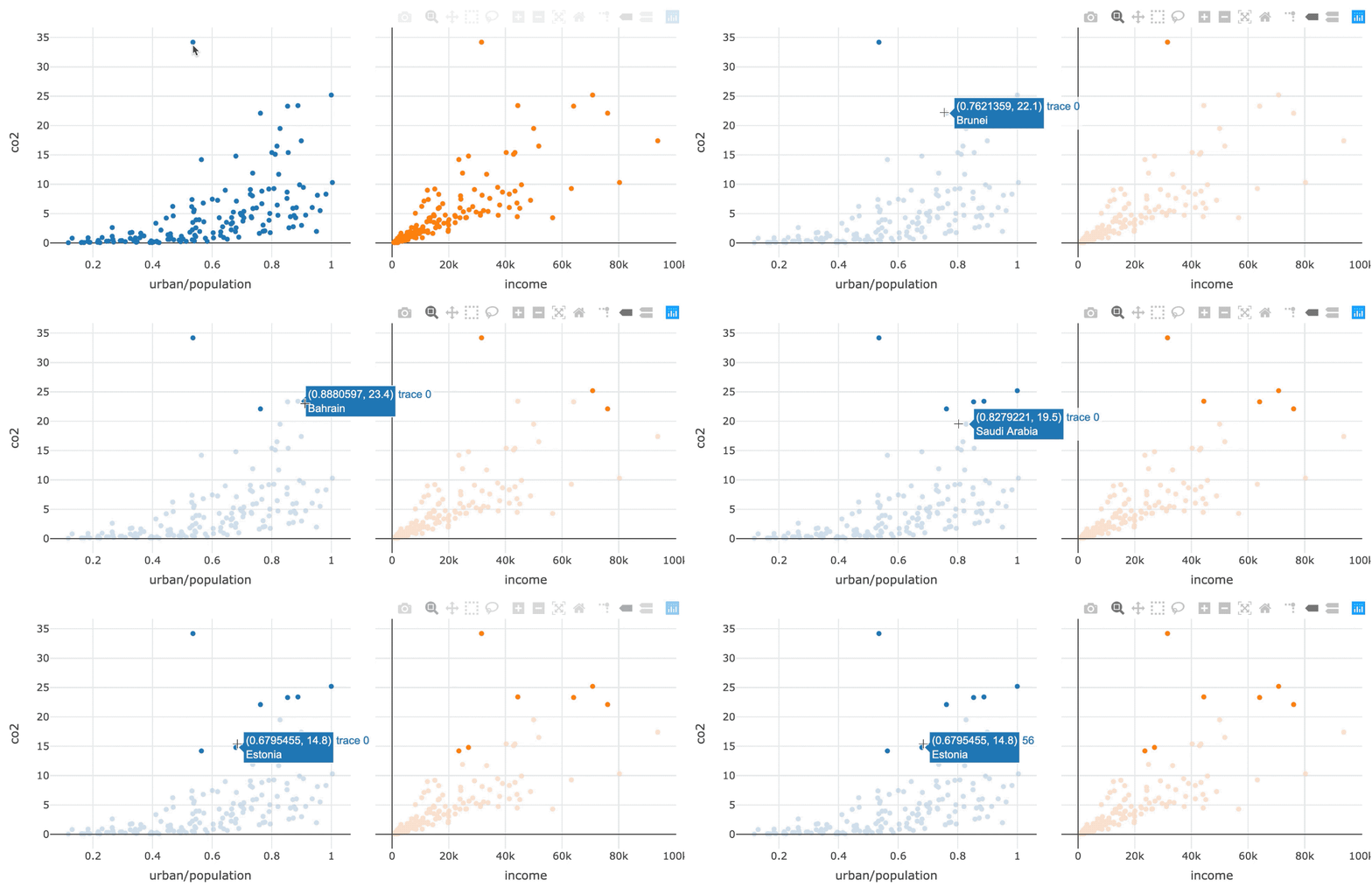
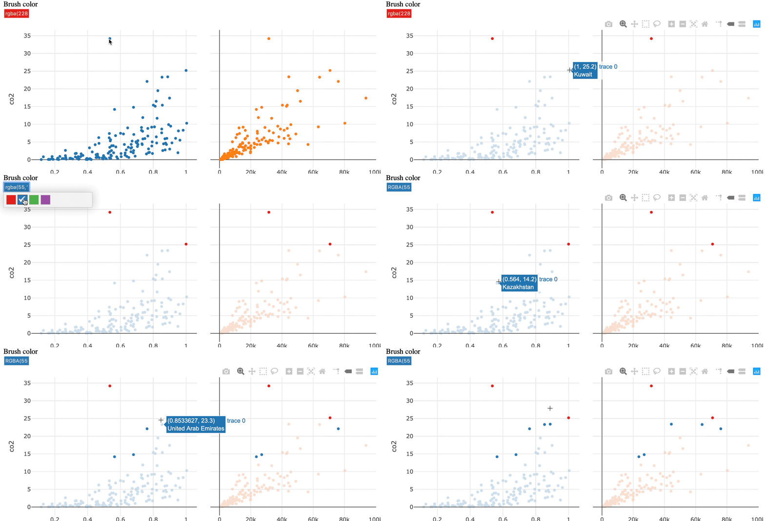
持續選取示意

R 的 plotly 互動式資料視覺化:中級

以色彩反白

彩色反白

R 的 plotly 互動式資料視覺化:中級

以色彩反白

加入 dynamic = TRUE 以啟用色彩選擇器

subplot(p1, p2, titleX = TRUE, shareY = TRUE) %>% 
  hide_legend() %>%
  highlight(persistent = TRUE, dynamic = TRUE)
R 的 plotly 互動式資料視覺化:中級

兩種操作方式

直接操作

透過與圖形元素互動來選取

連結範例 1

間接操作

透過圖表外的查詢來選取

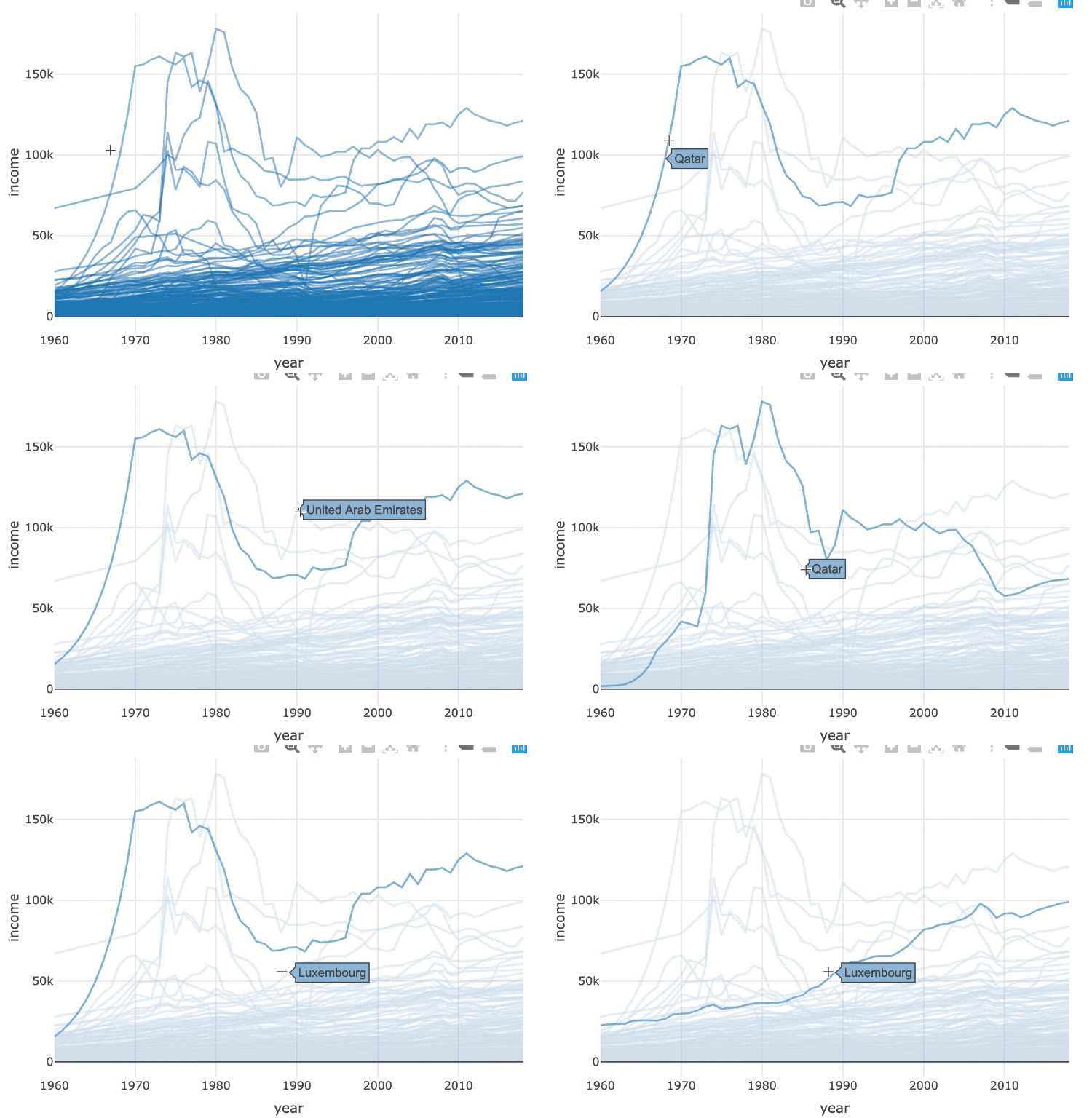
間接操作

R 的 plotly 互動式資料視覺化:中級

選取時間序列

R 的 plotly 互動式資料視覺化:中級

間接操作

world_indicators %>%
  SharedData$new(key = ~country) %>% 
  plot_ly(x = ~year, y = ~income, alpha = 0.5) %>%
  group_by(country) %>%
  add_lines()
R 的 plotly 互動式資料視覺化:中級

間接操作

world_indicators %>%
  SharedData$new(key = ~country, group = "Select a country") %>% 
  plot_ly(x = ~year, y = ~income, alpha = 0.5) %>%
  group_by(country) %>%
  add_lines() %>%
  highlight(selectize = TRUE)
R 的 plotly 互動式資料視覺化:中級

間接操作

R 的 plotly 互動式資料視覺化:中級

一起來練習吧!

R 的 plotly 互動式資料視覺化:中級

Preparing Video For Download...