Visualization with scatterplots
Analyzing Survey Data in R

Kelly McConville
Assistant Professor of Statistics
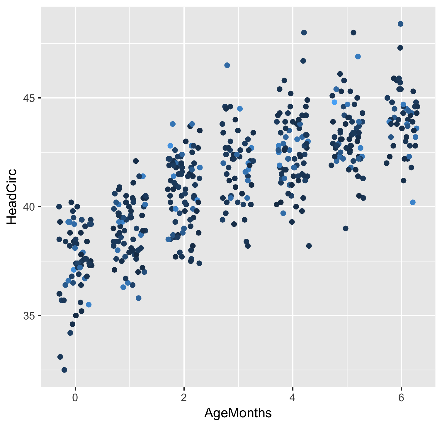
Scatterplots
ggplot(data = babies, mapping = aes(x = AgeMonths, y = HeadCirc)) +
  geom_point()

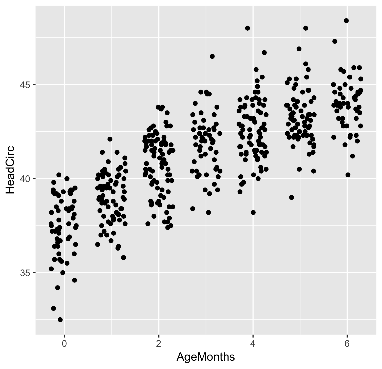
Jittering
ggplot(data = babies, mapping = aes(x = AgeMonths, y = HeadCirc)) +
  geom_jitter(width = 0.3, height = 0)
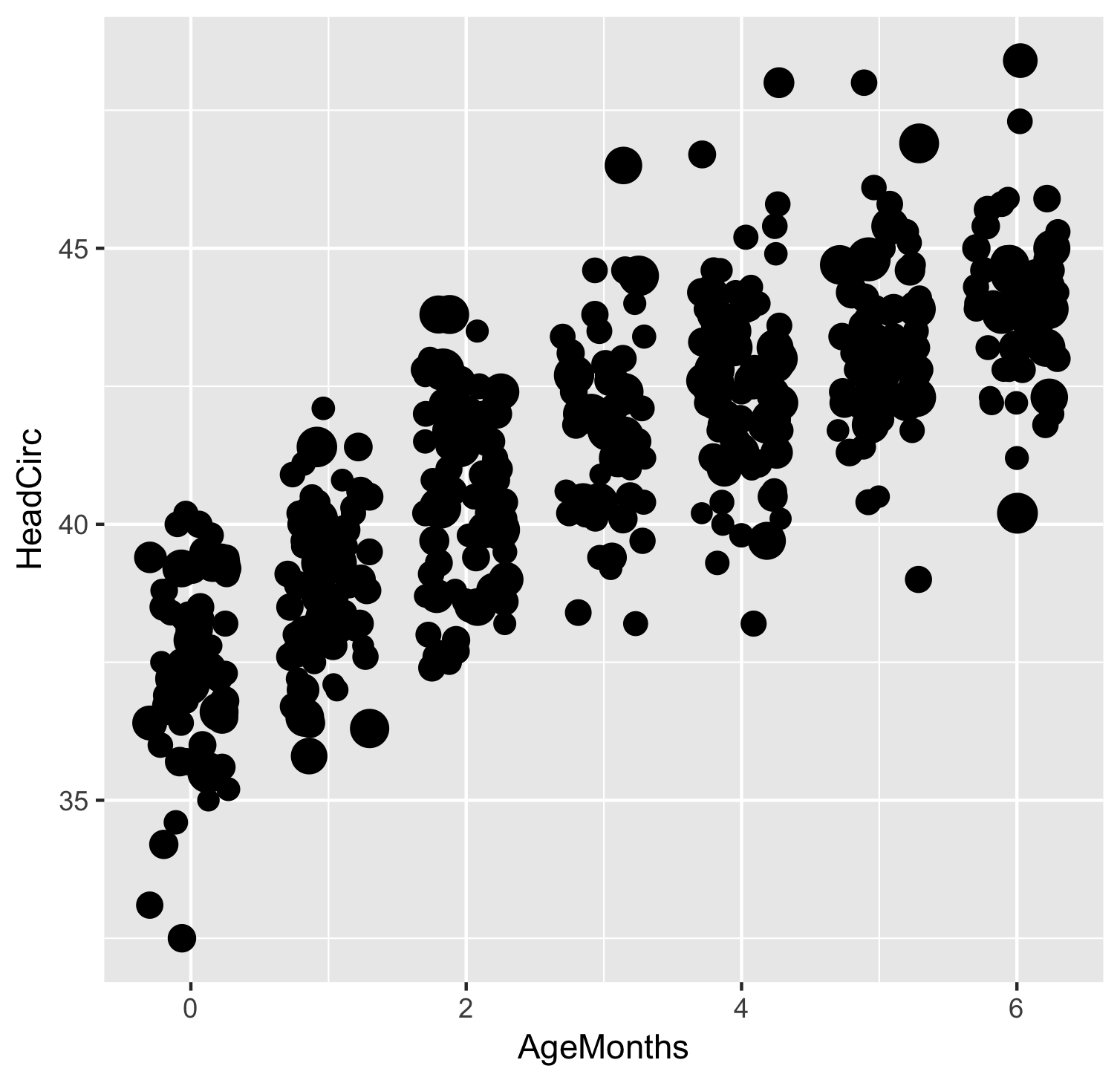
Bubble plots
ggplot(data = babies, mapping = aes(x = AgeMonths, y = HeadCirc,
                                    size = WTMEC4YR)) +
  geom_jitter(width = 0.3, height = 0) +
  guides(size = "none")
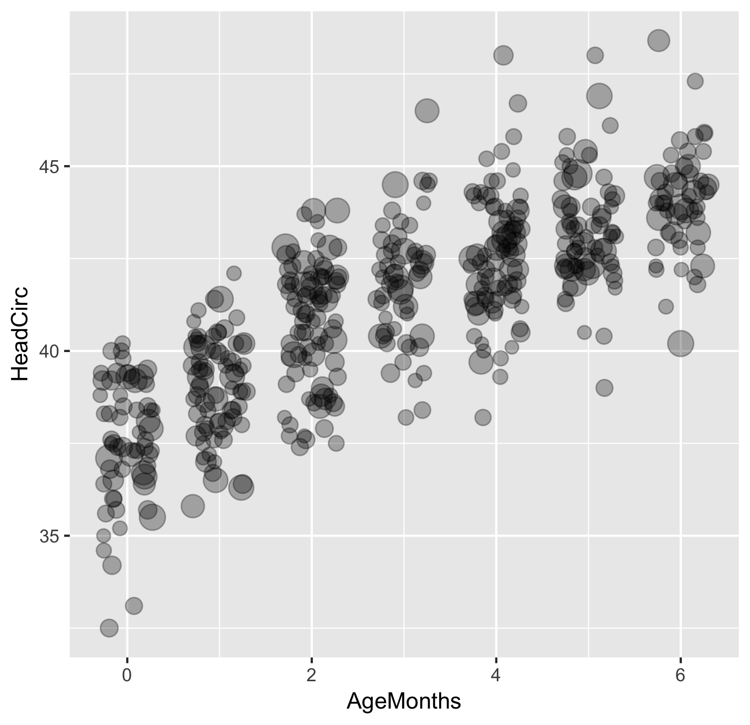
Bubble plots
ggplot(data = babies, mapping = aes(x = AgeMonths, y = HeadCirc,
                                    size = WTMEC4YR)) +
  geom_jitter(width = 0.3, height = 0, alpha = 0.3) +
  guides(size = "none")
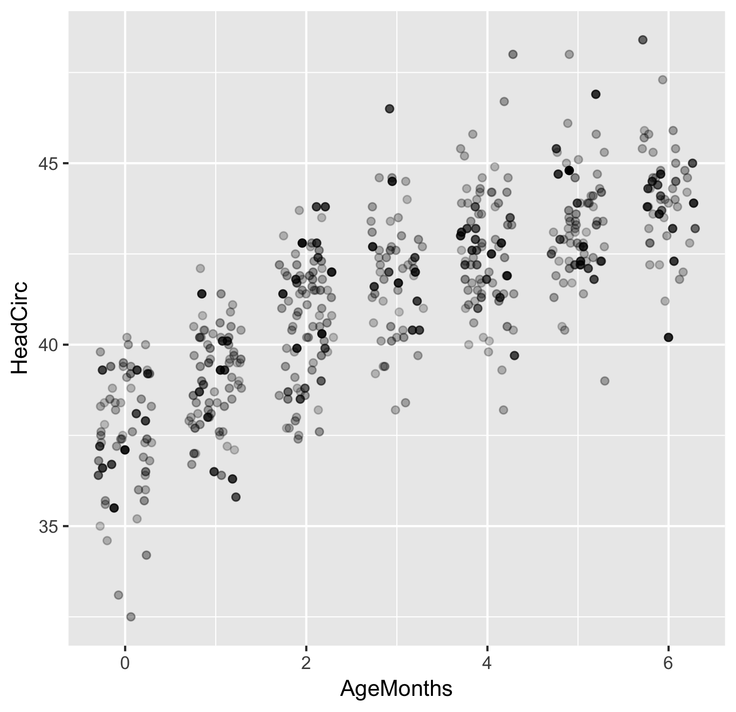
Survey-weighted scatterplots
ggplot(data = babies, mapping = aes(x = AgeMonths, y = HeadCirc,
                                    color = WTMEC4YR)) +
  geom_jitter(width = 0.3, height = 0) +
  guides(color = "none")
Survey-weighted scatterplots
ggplot(data = babies, mapping = aes(x = AgeMonths, y = HeadCirc,
                                    alpha = WTMEC4YR)) +
  geom_jitter(width = 0.3, height = 0) +
  guides(alpha = "none")