Visualizing a quantitative variable
Analyzing Survey Data in R

Kelly McConville
Assistant Professor of Statistics
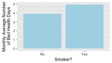
Bar graphs
ggplot(data = out, mapping = aes(x = SmokeNow, y = DaysPhysHlthBad)) +
  geom_col() +
  labs(y = "Monthly Average Number\n of Bad Health Days",
       x = "Smoker?")
Bar graphs with error bars
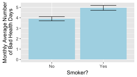
Bar graphs with error bars
ggplot(data = out, mapping = aes(x = SmokeNow, y = DaysPhysHlthBad,
                                 ymin = lower, ymax = upper)) +
  geom_col(fill = "lightblue") + geom_errorbar(width = 0.5) +
  labs(y = "Monthly Average Number\n of Bad Health Days",
       x = "Smoker?")
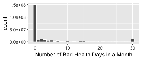
Histogram
ggplot(data = NHANESraw, mapping = aes(x = DaysPhysHlthBad,
                                       weight = WTMEC4YR)) +
  geom_histogram(binwidth = 1, color = "white") +
  labs(x = "Number of Bad Health Days in a Month")
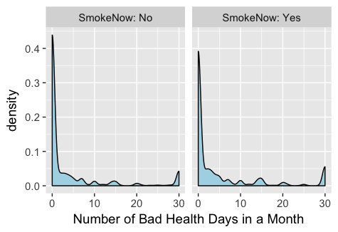
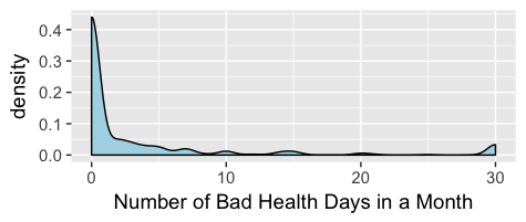
Density plot
Faceted density plots