Mapping demographic data with ggplot2
Analyzing US Census Data in R

Kyle Walker
Instructor
Modifying map colors
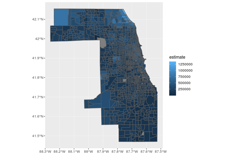
ggplot(cook_value, aes(fill = estimate, color = estimate)) +
  geom_sf() +
  scale_fill_viridis_c() +
  scale_color_viridis_c()
Analyzing US Census Data in R
Kyle Walker
Instructor
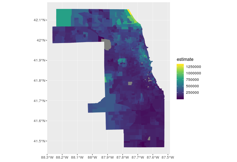
ggplot(cook_value, aes(fill = estimate, color = estimate)) +
geom_sf() +
scale_fill_viridis_c() +
scale_color_viridis_c()

