Using the distribution plot
Intermediate Data Visualization with Seaborn

Chris Moffitt
Instructor
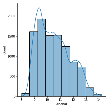
Creating a histogram
- The
displotfunction has multiple optional arguments - You can overlay a KDE plot on the histogram and specify the number of bins to use
sns.displot(df['alcohol'], kde=True, bins=10)
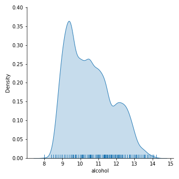
Alternative data distributions
- A rug plot is an alternative way to view the distribution of data by including small tickmarks along the x axis
- A kde curve and rug plot can be combined
sns.displot(df['alcohol'], kind='kde', rug=True, fill=True)
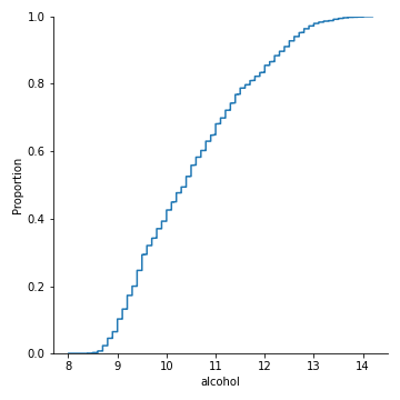
Further plot types
- The
displotfunction uses several functions includingkdeplot,rugplotandecdfplot - The
ecdfplotshows the cumulative distribution of the data
sns.displot(df['alcohol'], kind='ecdf')