Intermediate Interactive Data Visualization with plotly in R
Adam Loy
Statistician, Carleton College
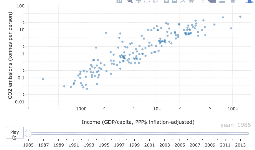
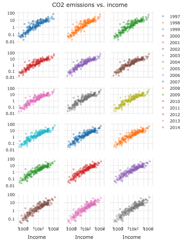
Is it easier to see the changes over time based on the animation? Or the faceted views?
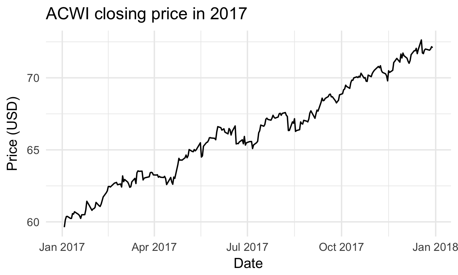
Visualization library for interactive and dynamic web-based graphics
Still under active development
Static
Interactive
Dynamic
A static graphic is permanently fixed after it is created
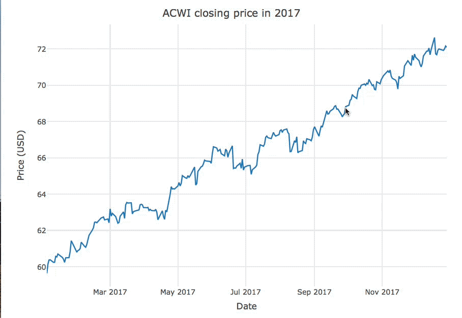
An interactive graphic changes based on an action performed by the user
A dynamic graphic changes periodically without user input
msci
# A tibble: 251 x 7
Date Open High Low Close Volume Adjusted
<date> <dbl> <dbl> <dbl> <dbl> <int> <dbl>
1 2017-01-03 79.8 79.8 78.4 78.7 646000 77.4
2 2017-01-04 79.1 81.1 79.1 80.7 849200 79.3
3 2017-01-05 80.4 81.8 80.4 81.6 557500 80.2
4 2017-01-06 81.8 83.9 81.8 83.4 597800 82.0
5 2017-01-09 83.1 83.5 82.6 82.7 668100 81.3
6 2017-01-10 82.3 82.6 81.1 81.5 558900 80.1
7 2017-01-11 81.2 81.6 80.8 81.5 365500 80.1
# ... with 244 more rows
library(plotly)
msci %>% plot_ly(x = ~Date, y = ~Close) %>% add_lines()
Intermediate Interactive Data Visualization with plotly in R