Making shinier charts
Intermediate Interactive Data Visualization with plotly in R

Adam Loy
Statistician, Carleton College
Apps without shiny
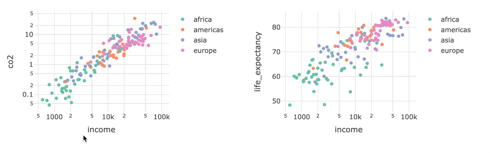
bscols() for column layouts
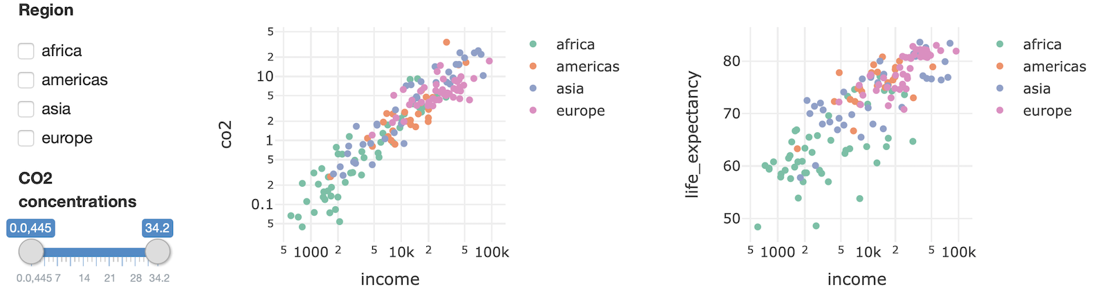
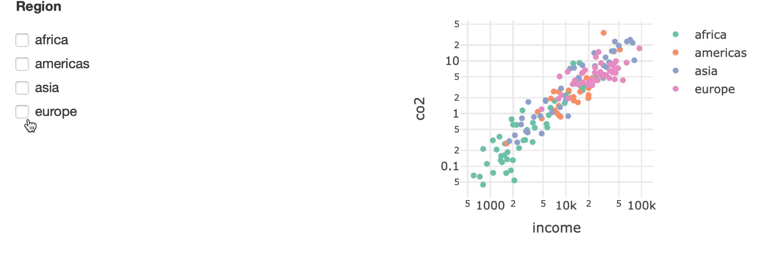
Adding filters: Checkboxes
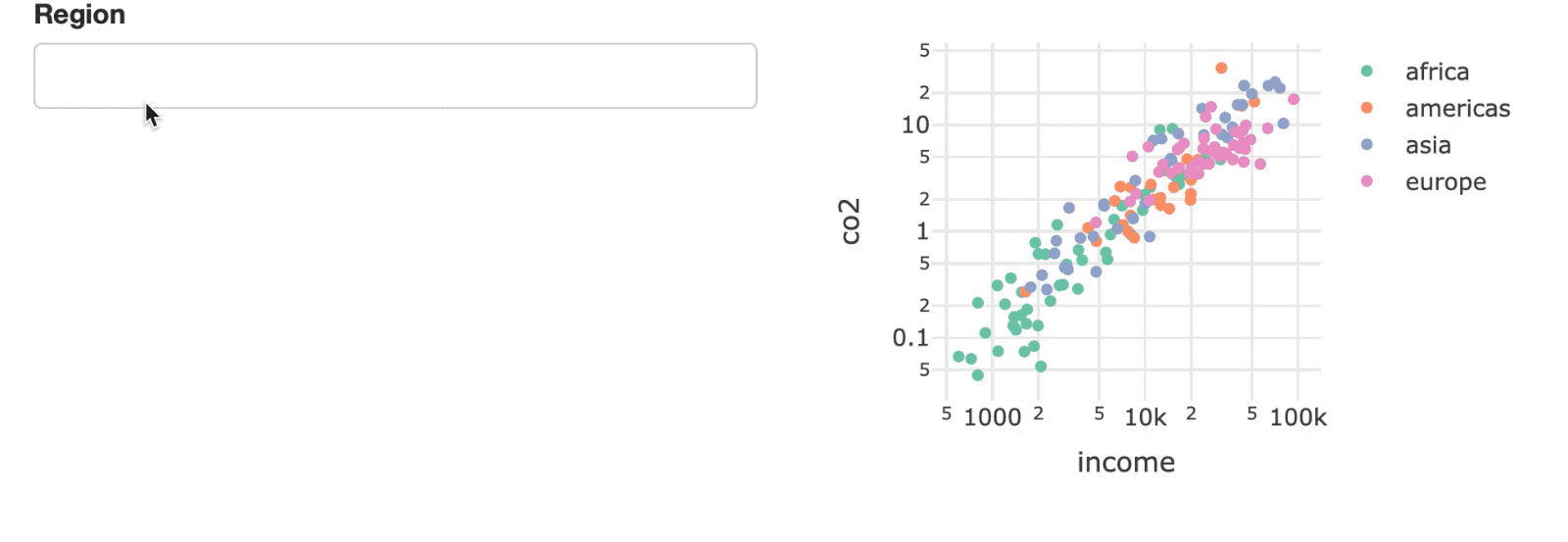
Adding filters: Select box
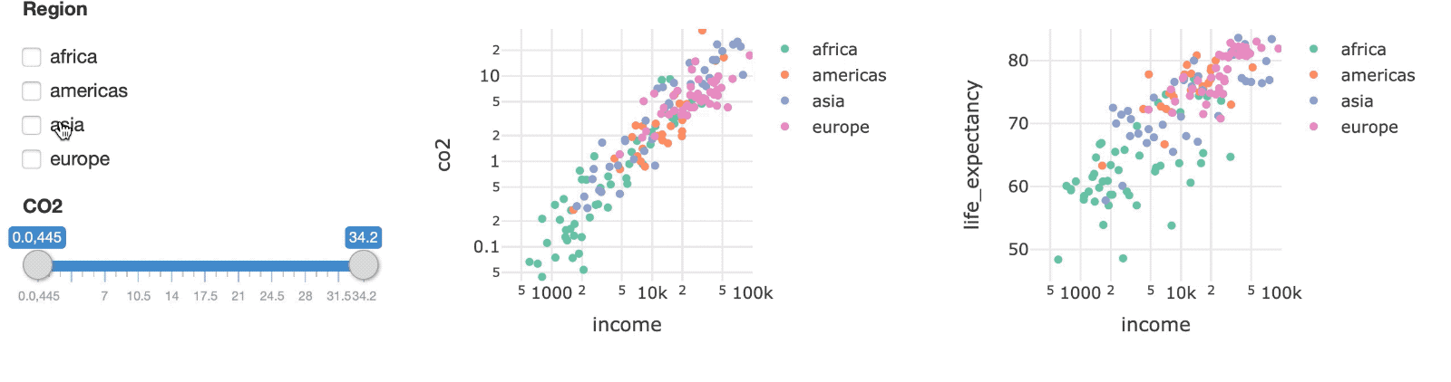
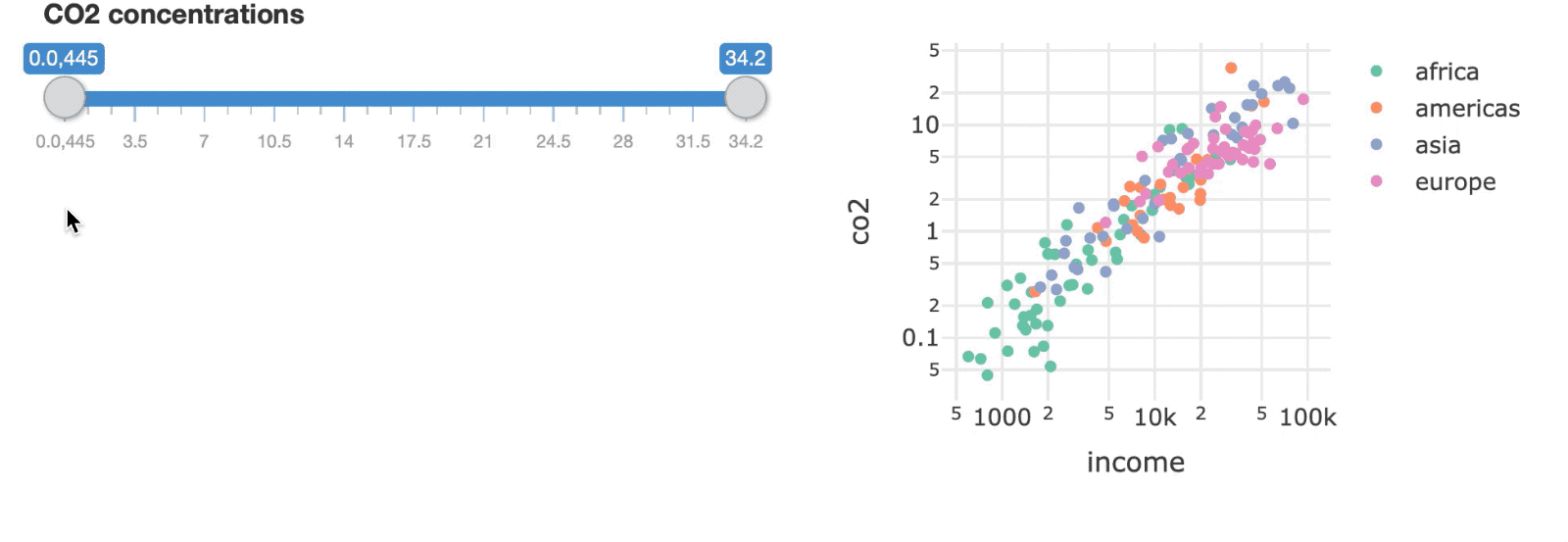
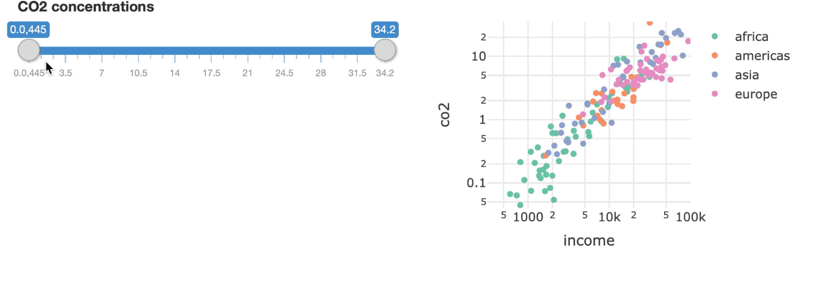
Adding filters: Sliders
Fixing the range of your axes
Putting the pieces together