Homophily
Predictive Analytics using Networked Data in R

Bart Baesens, Ph.D.
Professor of Data Science, KU Leuven and University of Southampton
Homophilic Networks
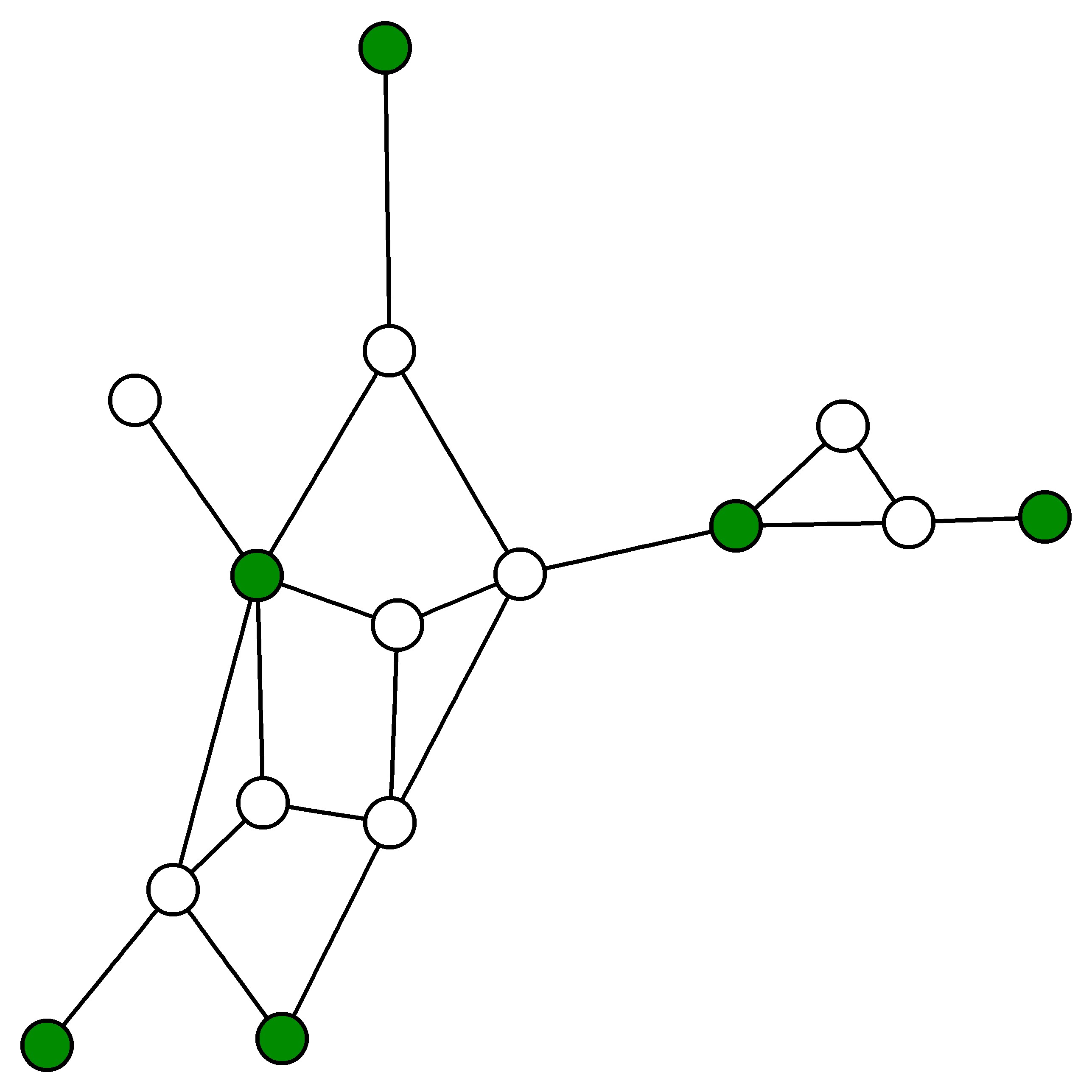
- Not Homophilic
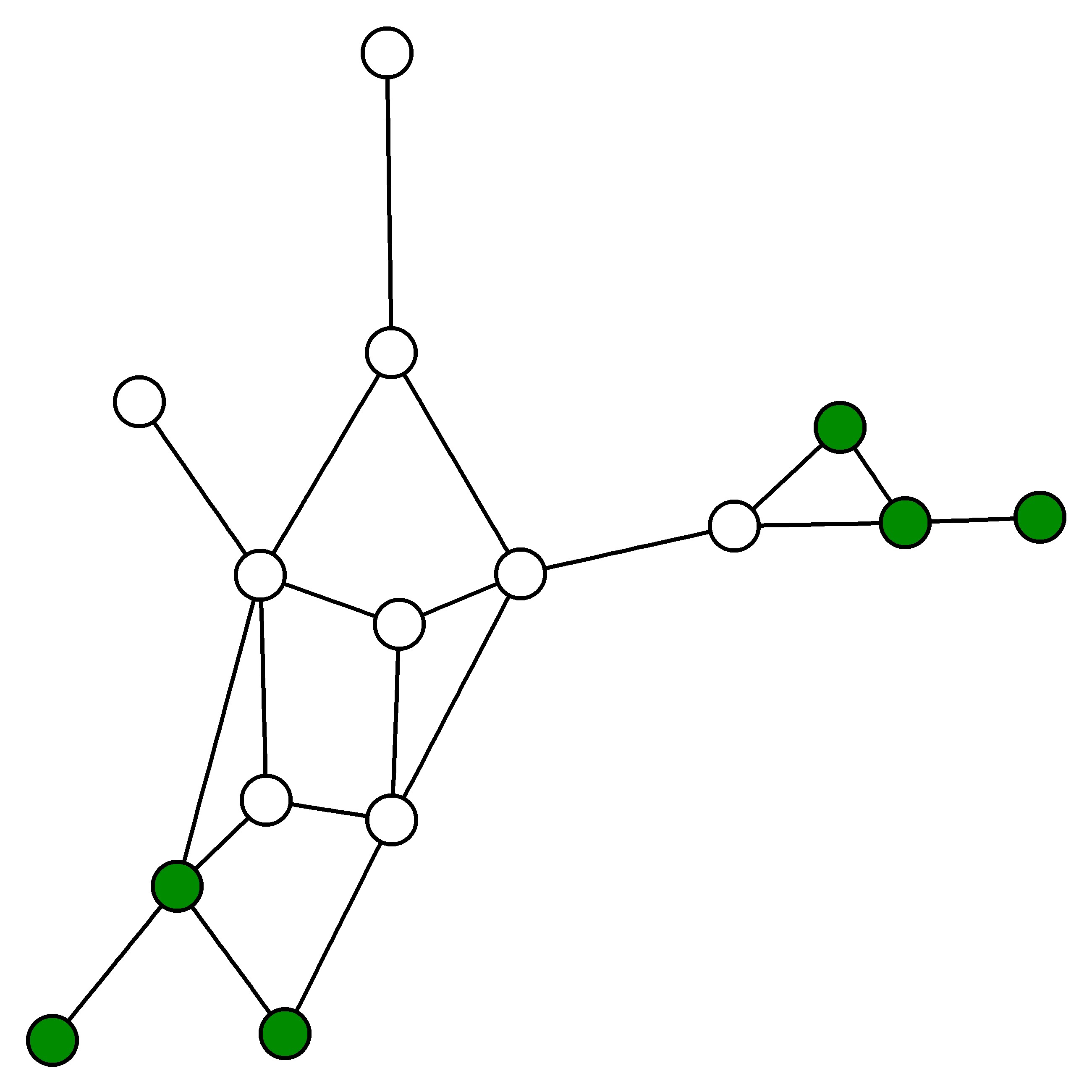
- Homophilic
Counting edge types
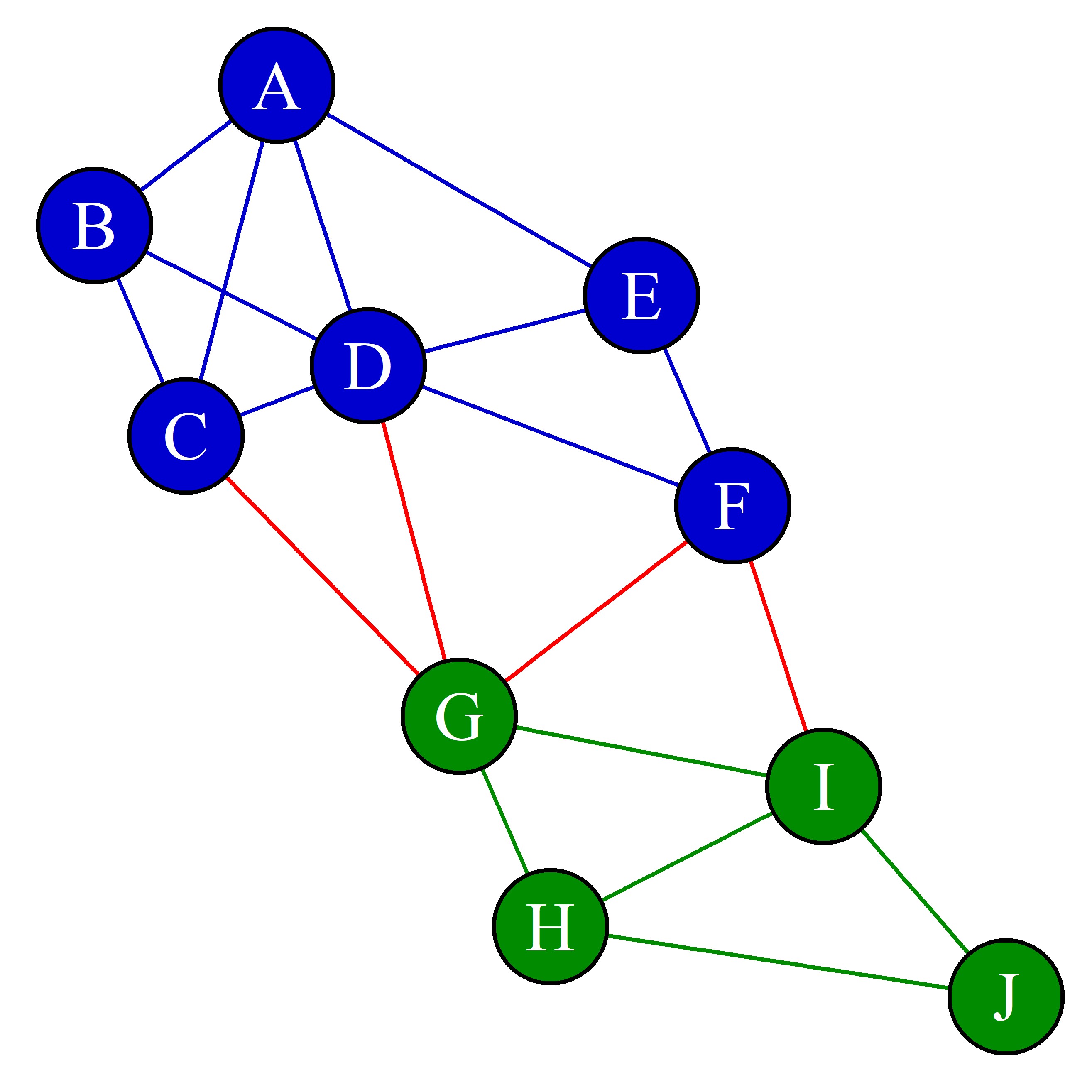
Network connectance
Predictive Analytics using Networked Data in R
Bart Baesens, Ph.D.
Professor of Data Science, KU Leuven and University of Southampton

