Employment and the Labor Force
Analyzing US Census Data in Python

Lee Hachadoorian
Asst. Professor of Instruction, Temple University
Employment Concepts
- Labor Force: People who are working or looking for work
- Unemployed: People unable to find work
- Unemployment Rate: $$Unemployed / LaborForce$$
- Labor Force Participation Rate: $$LaborForce / WorkingAgePop$$
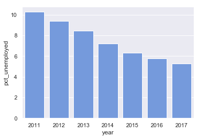
Creating a Bar Plot
   year  pct_unemployed
0  2011       10.264992
0  2012        9.373092
0  2013        8.435212
0  2014        7.226895
0  2015        6.297886
0  2016        5.750313
0  2017        5.281027
sns.barplot(
  x = "year", y = "pct_unemployed",
  color = "cornflowerblue",
  data = employment)

pandas.melt
print(hispanic_unemployment)
   year  pct_hisp_male_25to54_unemp  pct_hisp_female_25to54_unemp
0  2011                    9.352638                     11.426135
0  2012                    8.062535                     10.751855
0  2013                    6.915451                      9.524808
0  2014                    5.724187                      8.285590
0  2015                    5.040303                      7.070101
0  2016                    4.568206                      6.521980
0  2017                    4.184646                      5.706956
pandas.melt
# Rename columns col_rename = {"pct_hisp_male_25to54_unemp": "male", "pct_hisp_female_25to54_unemp": "female"} hispanic_unemployment.rename(columns = col_rename, inplace = True)# Melt DataFrame tidy_unemp = hispanic_unemployment.melt( id_vars = "year", value_vars = ["male", "female"], var_name = "sex", value_name = "pct_unemployed")
pandas.melt
# Rename columns col_rename = {"pct_hisp_male_25to54_unemp": "male", "pct_hisp_female_25to54_unemp": "female"} hispanic_unemployment.rename(columns = col_rename, inplace = True)# Melt DataFrame tidy_unemp = hispanic_unemployment.melt( id_vars = "year", # value_vars = ["male", "female"], var_name = "sex", value_name = "pct_unemployed")
pandas.melt
    year     sex  pct_unemployed
0   2011    male        9.352638
1   2012    male        8.062535
2   2013    male        6.915451
3   2014    male        5.724187
4   2015    male        5.040303
5   2016    male        4.568206
6   2017    male        4.184646
7   2011  female       11.426135
8   2012  female       10.751855
9   2013  female        9.524808
10  2014  female        8.285590
11  2015  female        7.070101
12  2016  female        6.521980
13  2017  female        5.706956
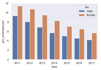
Creating a Grouped Bar Chart
sns.barplot(x = "year", y = "pct_unemployed", hue = "sex",
            data = tidy_unemp)

Let's practice!
Analyzing US Census Data in Python

