Visualizing financial ratios for comparison
Analyzing Financial Statements in Python

Rohan Chatterjee
Risk Modeler
Plotting the ratios of two companies
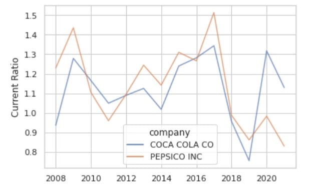
sns.set_style("whitegrid")
ax = sns.lineplot(data=current_ratio,
        x="Year",y='current_ratio',
        hue="company", alpha=0.7)
plt.xlabel("Year")
plt.ylabel("Current Ratio")
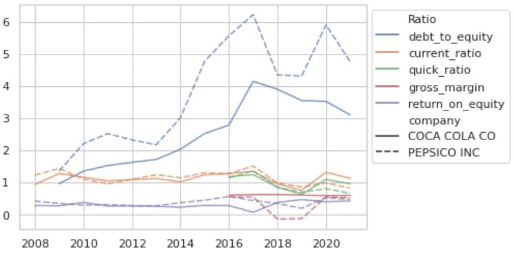
Overcrowding when using sns.lineplot()
This graph has too much information in too little space, making it overcrowded
Introducing sns.relplot()
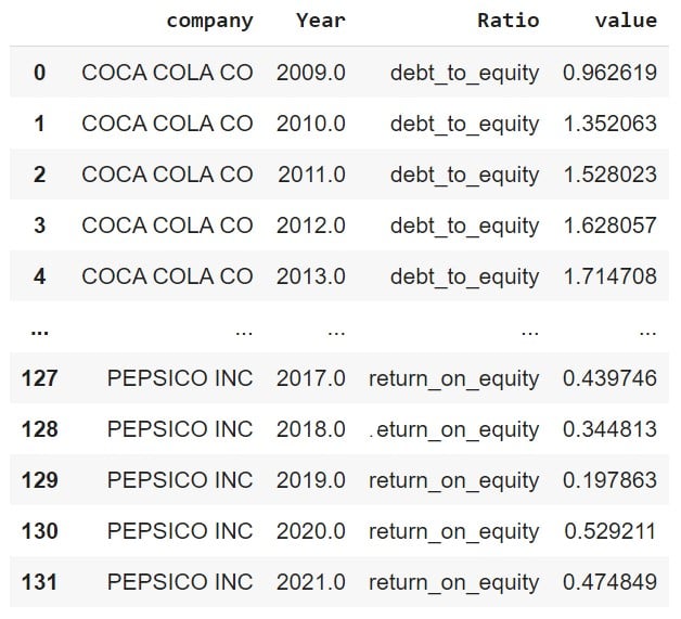
First step is to melt the DataFrame to get longitudinal data.
The "unmelted" DataFrame:
plot_df.head()

Now, melt the DataFrame
plot_df_melt = plot_df.melt(id_vars = ['company','Year'], var_name = "Ratio")
Plot ratios using sns.relplot()
ax = sns.relplot(data=df_melt, x="Year",
                 y="value", hue="Ratio",
                 alpha=0.7,
                 col='company',
                 kind='line')
ax.set_ylabels('')
ax.set_xlabels('')
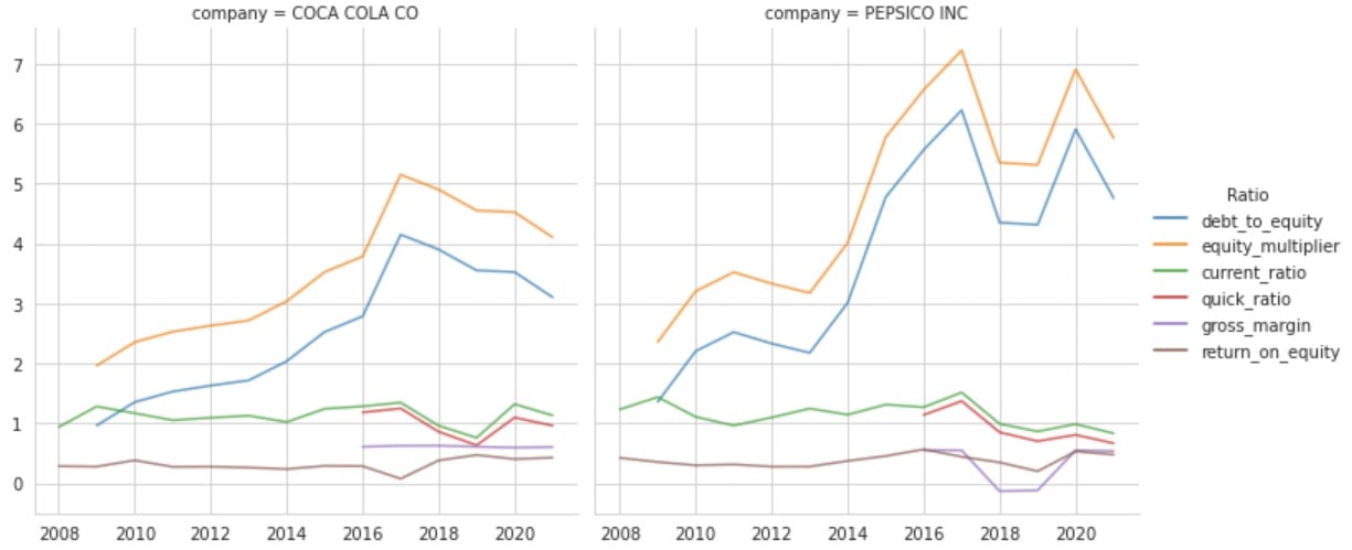
A closer look at the plot

Let's practice!
Analyzing Financial Statements in Python

